Parselmouth のインストールと動作確認(Praat 用の Python ライブラリ,振幅やスペクトログラムの表示など)(Python を使用)(Windows 上)
【関連する外部ページ】
- GitHub のページ: https://github.com/YannickJadoul/Parselmouth
前準備
Python 3.12 のインストール(Windows 上) [クリックして展開]
以下のいずれかの方法で Python 3.12 をインストールする。Python がインストール済みの場合、この手順は不要である。
方法1:winget によるインストール
管理者権限のコマンドプロンプトで以下を実行する。管理者権限のコマンドプロンプトを起動するには、Windows キーまたはスタートメニューから「cmd」と入力し、表示された「コマンドプロンプト」を右クリックして「管理者として実行」を選択する。
winget install --id Python.Python.3.12 -e --scope machine --silent --accept-source-agreements --accept-package-agreements --override "/quiet InstallAllUsers=1 PrependPath=1 Include_test=0 Include_pip=1 Include_launcher=1 InstallLauncherAllUsers=1 TargetDir=\"C:\Program Files\Python312\""
powershell -Command "$p='C:\Program Files\Python312'; $s=\"$p\Scripts\"; $m=[Environment]::GetEnvironmentVariable('Path','Machine'); if($m -notlike \"*$s*\") { [Environment]::SetEnvironmentVariable('Path', \"$p;$s;$m\", 'Machine') }"
--scope machine を指定することで、システム全体(全ユーザー向け)にインストールされる。このオプションの実行には管理者権限が必要である。インストール完了後、コマンドプロンプトを再起動すると PATH が自動的に設定される。
方法2:インストーラーによるインストール
- Python 公式サイト(https://www.python.org/downloads/)にアクセスし、「Download Python 3.x.x」ボタンから Windows 用インストーラーをダウンロードする。
- ダウンロードしたインストーラーを実行する。
- 初期画面の下部に表示される「Add python.exe to PATH」に必ずチェックを入れてから「Customize installation」を選択する。このチェックを入れ忘れると、コマンドプロンプトから
pythonコマンドを実行できない。 - 「Install Python 3.xx for all users」にチェックを入れ、「Install」をクリックする。
インストールの確認
コマンドプロンプトで以下を実行する。
python --versionバージョン番号(例:Python 3.12.x)が表示されればインストール成功である。「'python' は、内部コマンドまたは外部コマンドとして認識されていません。」と表示される場合は、インストールが正常に完了していない。
Git のインストール
管理者権限のコマンドプロンプトで以下を実行する。管理者権限のコマンドプロンプトを起動するには、Windows キーまたはスタートメニューから「cmd」と入力し、表示された「コマンドプロンプト」を右クリックして「管理者として実行」を選択する。
REM Git をシステム領域にインストール
winget install --scope machine --id Git.Git -e --silent --disable-interactivity --force --accept-source-agreements --accept-package-agreements --override "/VERYSILENT /NORESTART /NOCANCEL /SP- /CLOSEAPPLICATIONS /RESTARTAPPLICATIONS /COMPONENTS=""icons,ext\reg\shellhere,assoc,assoc_sh"" /o:PathOption=Cmd /o:CRLFOption=CRLFCommitAsIs /o:BashTerminalOption=MinTTY /o:DefaultBranchOption=main /o:EditorOption=VIM /o:SSHOption=OpenSSH /o:UseCredentialManager=Enabled /o:PerformanceTweaksFSCache=Enabled /o:EnableSymlinks=Disabled /o:EnableFSMonitor=Disabled"
【関連する外部ページ】
- Git の公式ページ: https://git-scm.com/
parselmouth のインストール(Windows 上)
- 以下の手順を管理者権限のコマンドプロンプトで実行する
(手順:Windowsキーまたはスタートメニュー →
cmdと入力 → 右クリック → 「管理者として実行」)。 - pip を用いてインストール
pip install -U praat-parselmouth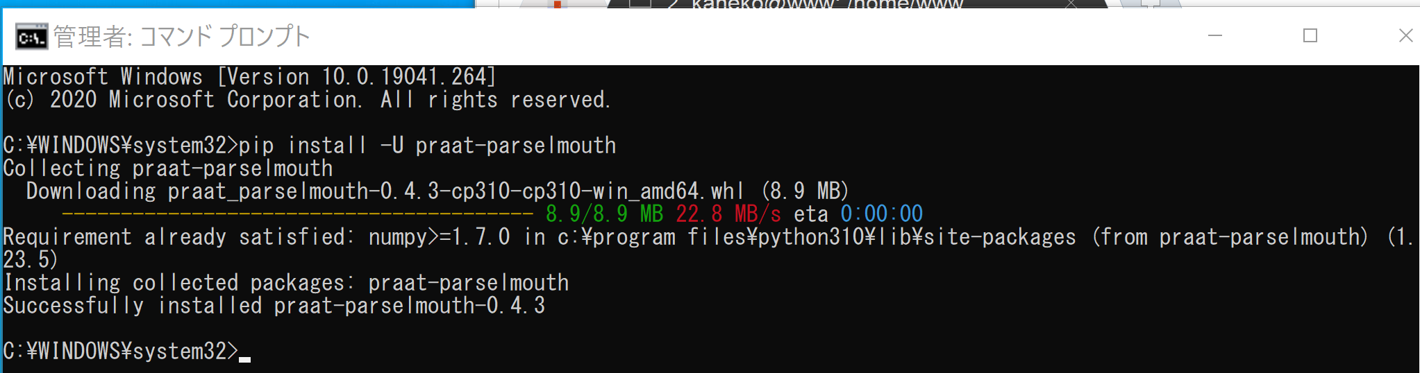
動作確認
- 以下の手順を管理者権限のコマンドプロンプトで実行する
(手順:Windowsキーまたはスタートメニュー →
cmdと入力 → 右クリック → 「管理者として実行」)。 - 公式ページから parselmouth のファイルをダウンロード
cd /d c:%HOMEPATH%
rmdir /s /q Parselmouth
git clone --recursive https://github.com/YannickJadoul/Parselmouth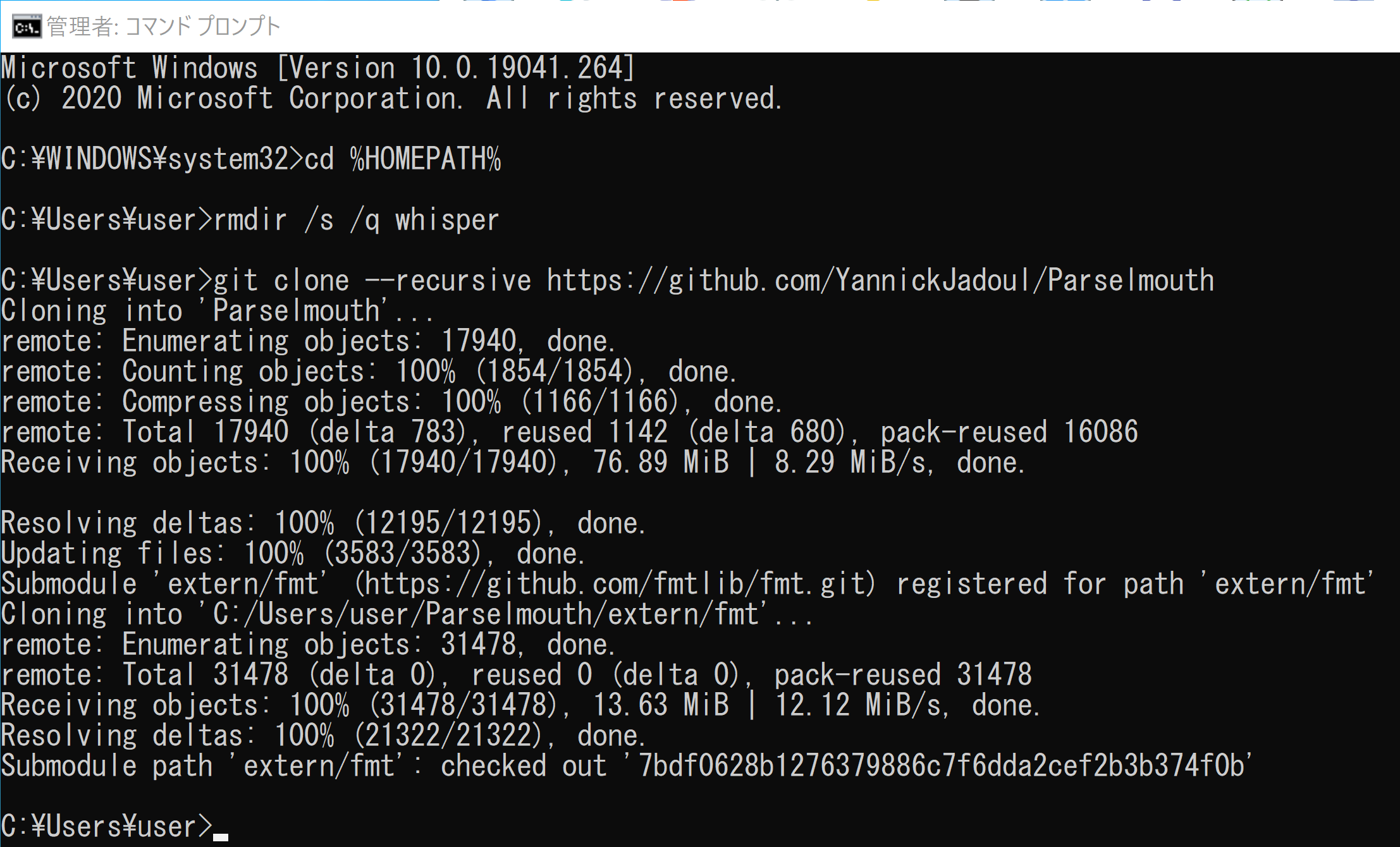
- numpy, matplotlib, seaborn のインストール
pip install -U numpy matplotlib seaborn
- 振幅の表示
公式ページに記載のプログラムを使用
次のコマンドを実行
cd /d c:%HOMEPATH%
cd parselmouth
jupyter qtconsole
次の Python プログラムを実行する.Matplotlib を使うので,Jupyter QtConsole や Jupyter ノートブック (Jupyter Notebook) の利用が便利である.
import parselmouth

import numpy as np
import matplotlib.pyplot as plt
import seaborn as sns

sns.set() # Use seaborn's default style to make attractive graphs

# Plot nice figures using Python's "standard" matplotlib library
snd = parselmouth.Sound("docs/examples/audio/the_north_wind_and_the_sun.wav")
plt.figure()
plt.plot(snd.xs(), snd.values.T)
plt.xlim([snd.xmin, snd.xmax])
plt.xlabel("time [s]")
plt.ylabel("amplitude")
plt.show() # or plt.savefig("sound.png"), or plt.savefig("sound.pdf")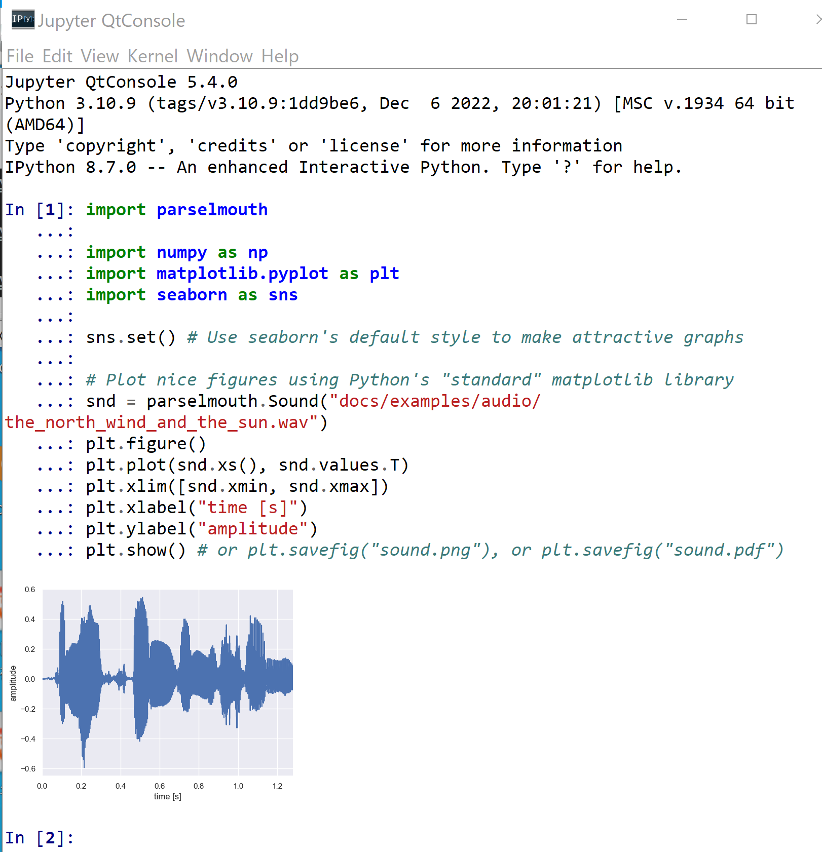
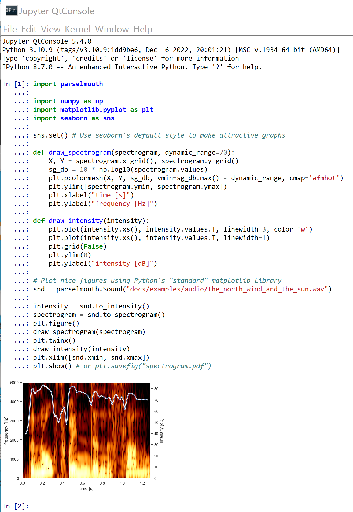
- スペクトログラムの表示
公式ページに記載のプログラムを使用
次のコマンドを実行
cd /d c:%HOMEPATH%
cd parselmouth
jupyter qtconsole
次の Python プログラムを実行する.Matplotlib を使うので,Jupyter QtConsole や Jupyter ノートブック (Jupyter Notebook) の利用が便利である.
import parselmouth

import numpy as np
import matplotlib.pyplot as plt
import seaborn as sns

sns.set() # Use seaborn's default style to make attractive graphs

def draw_spectrogram(spectrogram, dynamic_range=70):
    X, Y = spectrogram.x_grid(), spectrogram.y_grid()
    sg_db = 10 * np.log10(spectrogram.values)
    plt.pcolormesh(X, Y, sg_db, vmin=sg_db.max() - dynamic_range, cmap='afmhot')
    plt.ylim([spectrogram.ymin, spectrogram.ymax])
    plt.xlabel("time [s]")
    plt.ylabel("frequency [Hz]")

def draw_intensity(intensity):
    plt.plot(intensity.xs(), intensity.values.T, linewidth=3, color='w')
    plt.plot(intensity.xs(), intensity.values.T, linewidth=1)
    plt.grid(False)
    plt.ylim(0)
    plt.ylabel("intensity [dB]")

# Plot nice figures using Python's "standard" matplotlib library
snd = parselmouth.Sound("docs/examples/audio/the_north_wind_and_the_sun.wav")

intensity = snd.to_intensity()
spectrogram = snd.to_spectrogram()
plt.figure()
draw_spectrogram(spectrogram)
plt.twinx()
draw_intensity(intensity)
plt.xlim([snd.xmin, snd.xmax])
plt.show() # or plt.savefig("spectrogram.pdf")