CIFAR-10 データセットによる学習と分類(TensorFlow データセット,TensorFlow,Python を使用)(Windows 上,Google Colaboratroy の両方を記載)
CIFAR-10 データセット(
ニューラルネットワークの作成,学習,データの分類を行う.
TensorFlow データセットのCIFAR-10 データセットを使用する.
【目次】
説明資料: [パワーポイント]
【サイト内の関連ページ】
【関連する外部ページ】
TensorFlow のチュートリアルの Web ページに記載のソースコードを使用している.
1. Google Colaboratory での実行
Google Colaboratory のページ:
次のリンクをクリックすると,Google Colaboratory のノートブックが開く. そして,Google アカウントでログインすると,Google Colaboratory のノートブック内のコード等を編集したり再実行したりができる.編集した場合でも,他の人に影響が出たりということはない.そして,編集後のものを,各自の Google ドライブ内に保存することもできる.
https://colab.research.google.com/drive/1isb39RL7JtTdHaLQfp3cC8vMVd7OXbiV?usp=sharing
2. Windows での実行
Python 3.12,Git のインストール(Windows 上)
Pythonは,プログラミング言語の1つ. Gitは,分散型のバージョン管理システム.
【手順】
- Windows で,管理者権限でコマンドプロンプトを起動(手順:Windowsキーまたはスタートメニュー >
cmdと入力 > 右クリック > 「管理者として実行」)。次のコマンドを実行
次のコマンドは,Python ランチャーとPython 3.12とGitをインストールし,Gitにパスを通すものである.
次のコマンドでインストールされるGitは 「git for Windows」と呼ばれるものであり, Git,MinGW などから構成されている.
reg add "HKLM\SYSTEM\CurrentControlSet\Control\FileSystem" /v LongPathsEnabled /t REG_DWORD /d 1 /f
REM Python, Git をシステム領域にインストール
winget install --scope machine --id Python.Python.3.12 --id Python.Launcher --id Git.Git -e --silent
REM Python のパス
set "INSTALL_PATH=C:\Program Files\Python312"
echo "%PATH%" | find /i "%INSTALL_PATH%" >nul
if errorlevel 1 setx PATH "%PATH%;%INSTALL_PATH%" /M >nul
echo "%PATH%" | find /i "%INSTALL_PATH%\Scripts" >nul
if errorlevel 1 setx PATH "%PATH%;%INSTALL_PATH%\Scripts" /M >nul
REM Git のパス
set "NEW_PATH=C:\Program Files\Git\cmd"
if exist "%NEW_PATH%" echo "%PATH%" | find /i "%NEW_PATH%" >nul
if exist "%NEW_PATH%" if errorlevel 1 setx PATH "%PATH%;%NEW_PATH%" /M >nul
【関連する外部ページ】
- Python の公式ページ: https://www.python.org/
- Git の公式ページ: https://git-scm.com/
【サイト内の関連ページ】
【関連項目】 Python, Git バージョン管理システム, Git の利用
TensorFlow 2.10.1 のインストール(Windows 上)
- Windows で,管理者権限でコマンドプロンプトを起動(手順:Windowsキーまたはスタートメニュー >
cmdと入力 > 右クリック > 「管理者として実行」)。 - TensorFlow 2.10.1 のインストール(Windows 上)
次のコマンドを実行することにより,TensorFlow 2.10.1 および関連パッケージ(tf_slim,tensorflow_datasets,tensorflow-hub,Keras,keras-tuner,keras-visualizer)がインストール(インストール済みのときは最新版に更新)される. そして,Pythonパッケージ(Pillow, pydot, matplotlib, seaborn, pandas, scipy, scikit-learn, scikit-learn-intelex, opencv-python, opencv-contrib-python)がインストール(インストール済みのときは最新版に更新)される.
python -m pip uninstall -y protobuf tensorflow tensorflow-cpu tensorflow-gpu tensorflow-intel tensorflow-text tensorflow-estimator tf-models-official tf_slim tensorflow_datasets tensorflow-hub keras keras-tuner keras-visualizer
python -m pip install -U protobuf tensorflow==2.10.1 tf_slim tensorflow_datasets==4.8.3 tensorflow-hub tf-keras keras keras_cv keras-tuner keras-visualizer
python -m pip install git+https://github.com/tensorflow/docs
python -m pip install git+https://github.com/tensorflow/examples.git
python -m pip install git+https://www.github.com/keras-team/keras-contrib.git
python -m pip install -U pillow pydot matplotlib seaborn pandas scipy scikit-learn scikit-learn-intelex opencv-python opencv-contrib-python
Graphviz のインストール
Windows での Graphviz のインストール: 別ページ »で説明
numpy,matplotlib, seaborn, scikit-learn, pandas, pydot のインストール
- Windows で,管理者権限でコマンドプロンプトを起動(手順:Windowsキーまたはスタートメニュー >
cmdと入力 > 右クリック > 「管理者として実行」)。次のコマンドを実行する.
python -m pip install -U numpy matplotlib seaborn scikit-learn pandas pydot
CIFAR-10 データセットのロード
【Python の利用】
Python は,次のコマンドで起動できる.
Python 開発環境(Jupyter Qt Console, Jupyter ノートブック (Jupyter Notebook), Jupyter Lab, Nteract, Spyder, PyCharm, PyScripterなど)も便利である.
Python のまとめ: 別ページ »にまとめ
- Windows で,コマンドプロンプトを実行.
- jupyter qtconsole の起動
これ以降の操作は,jupyter qtconsole で行う.
jupyter qtconsole
Python 開発環境として,Jupyter Qt Console, Jupyter ノートブック (Jupyter Notebook), Jupyter Lab, Nteract, spyder のインストール
Windows で,管理者権限でコマンドプロンプトを起動(手順:Windowsキーまたはスタートメニュー >
cmdと入力 > 右クリック > 「管理者として実行」)。し,次のコマンドを実行する.次のコマンドを実行することにより,pipとsetuptoolsを更新する,Jupyter Notebook,PyQt5、Spyderなどの主要なPython環境がインストールされる.
python -m pip install -U pip setuptools requests notebook==6.5.7 jupyterlab jupyter jupyter-console jupytext PyQt5 nteract_on_jupyter spyder
- パッケージのインポート,TensorFlow のバージョン確認など
from __future__ import absolute_import, division, print_function, unicode_literals
import tensorflow as tf
from tensorflow.keras import layers
from tensorflow.keras import backend as K
K.clear_session()
import numpy as np
import tensorflow_datasets as tfds
from tensorflow.keras.preprocessing import image

%matplotlib inline
import matplotlib.pyplot as plt
import warnings
warnings.filterwarnings('ignore')   # Suppress Matplotlib warnings

# TensorFlow のバージョン
print(tf.__version__)

# GPU を利用しているか
gpus = tf.config.list_physical_devices(device_type = 'GPU')
if len(gpus)>0:
    print(f">> GPU detected. {gpus[0].name}")
    tf.config.experimental.set_memory_growth(gpus[0], True)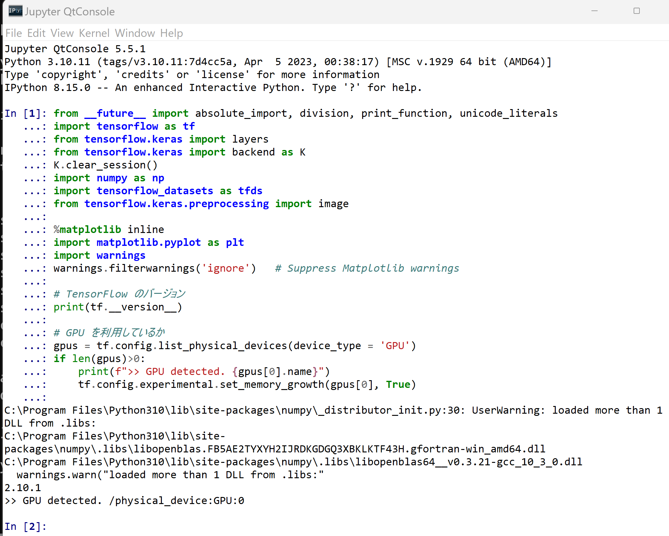
- CIFAR-10 データセットのロード
- x_train: サイズ 32 ×32 の 60000枚の濃淡画像
- y_train: 50000枚の濃淡画像それぞれの,種類番号(0 から 9 のどれか)
- x_test: サイズ 32 ×32 の 10000枚の濃淡画像
- y_test: 10000枚の濃淡画像それぞれの,種類番号(0 から 9 のどれか)
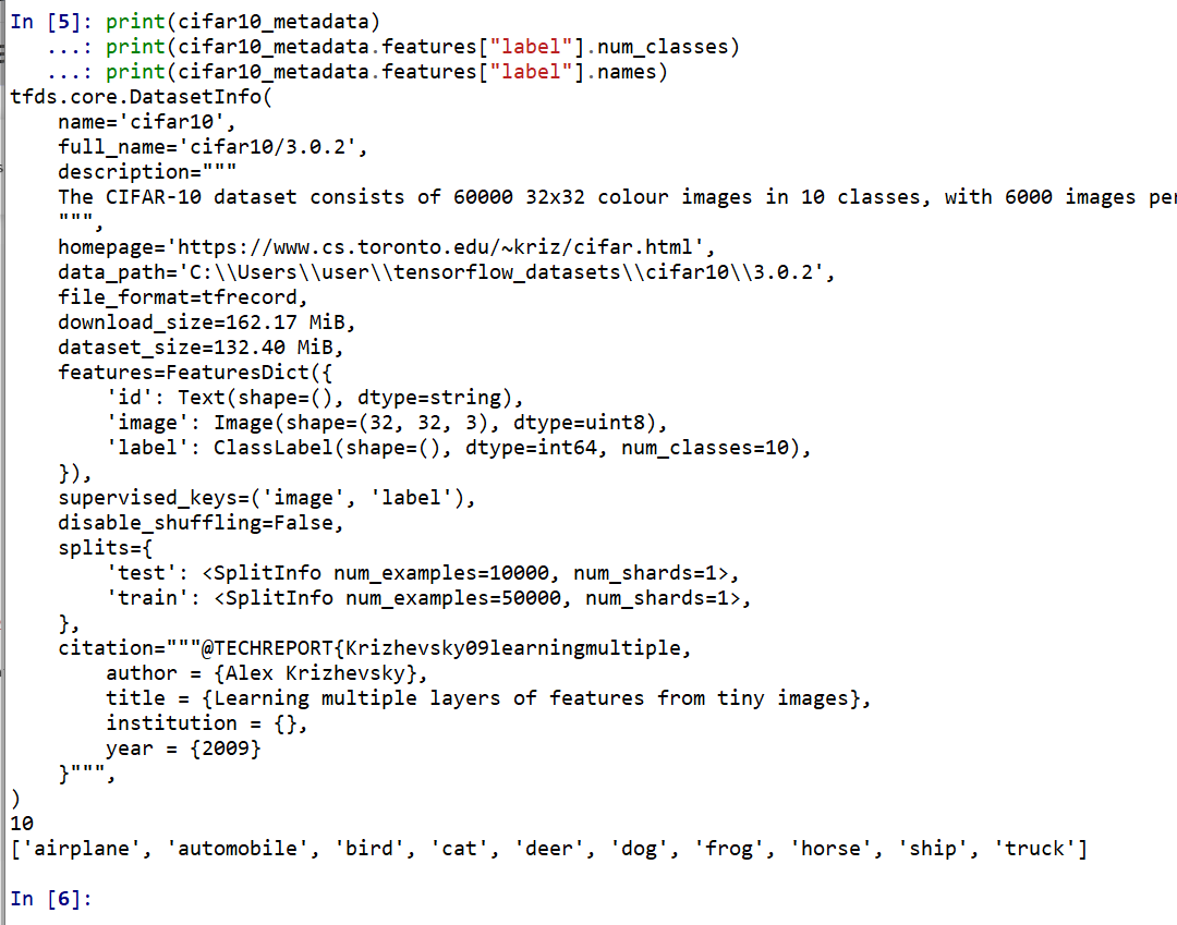
tensorflow_datasets の loadで, 「batch_size = -1」を指定して,一括読み込みを行っている.cifar10, cifar10_metadata = tfds.load('cifar10', with_info = True, shuffle_files=True, as_supervised=True, batch_size = -1) x_train, y_train, x_test, y_test = cifar10['train'][0], cifar10['train'][1], cifar10['test'][0], cifar10['test'][1] print(cifar10_metadata)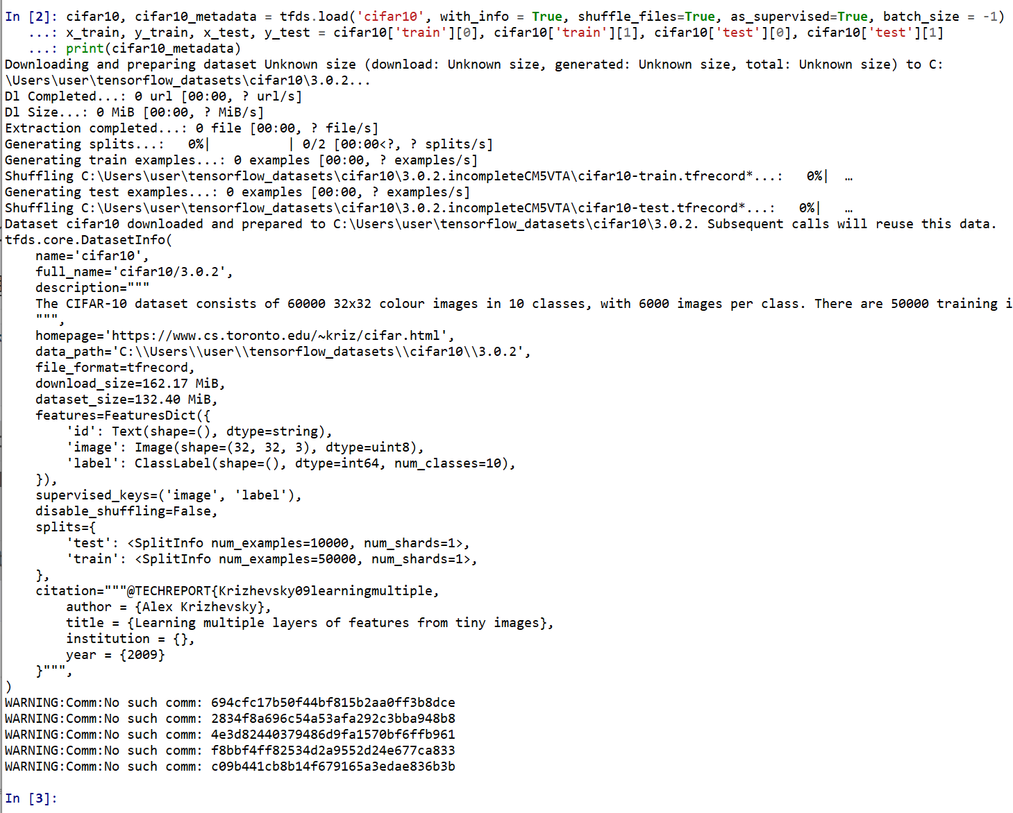
CIFAR-10 データセットの確認
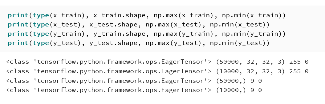
- 型と形と最大値と最小値の確認
print(type(x_train), x_train.shape, np.max(x_train), np.min(x_train))
print(type(x_test), x_test.shape, np.max(x_test), np.min(x_test))
print(type(y_train), y_train.shape, np.max(y_train), np.min(y_train))
print(type(y_test), y_test.shape, np.max(y_test), np.min(y_test))
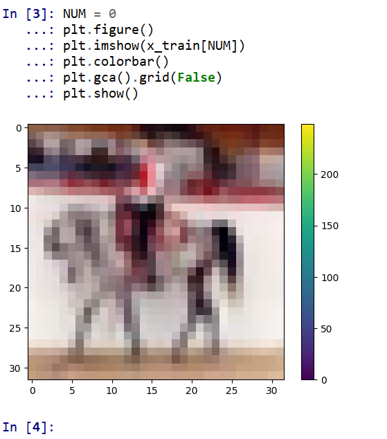
- データセットの中の画像を表示
MatplotLib を用いて,0 番目の画像を表示する
NUM = 0
plt.figure()
plt.imshow(x_train[NUM])
plt.colorbar()
plt.gca().grid(False)
plt.show()
- データセットの情報を表示
print(cifar10_metadata)
print(cifar10_metadata.features["label"].num_classes)
print(cifar10_metadata.features["label"].names)
- 主成分分析の結果である主成分スコアのプロット
x_train, x_test は主成分分析で2次元にマッピング, y_train, y_test は色.
import pandas as pd
import seaborn as sns
sns.set()
import sklearn.decomposition
# 主成分分析
def prin(A, n):
    pca = sklearn.decomposition.PCA(n_components=n)
    return pca.fit_transform(A)

# 主成分分析で2つの成分を得る
def prin2(A):
    return prin(A, 2)

# M の最初の2列を,b で色を付けてプロット
def scatter_plot(M, b, alpha):
    a12 = pd.DataFrame( M[:,0:2], columns=['a1', 'a2'] )
    a12['target'] = b
    sns.scatterplot(x='a1', y='a2', hue='target', data=a12, palette=sns.color_palette("hls", np.max(b) + 1), legend="full", alpha=alpha)

# 主成分分析プロット
def pcaplot(A, b, alpha):
    scatter_plot(prin2(A), b, alpha)

pcaplot(np.reshape(x_train, (x_train.shape[0], -1)), y_train, 0.1)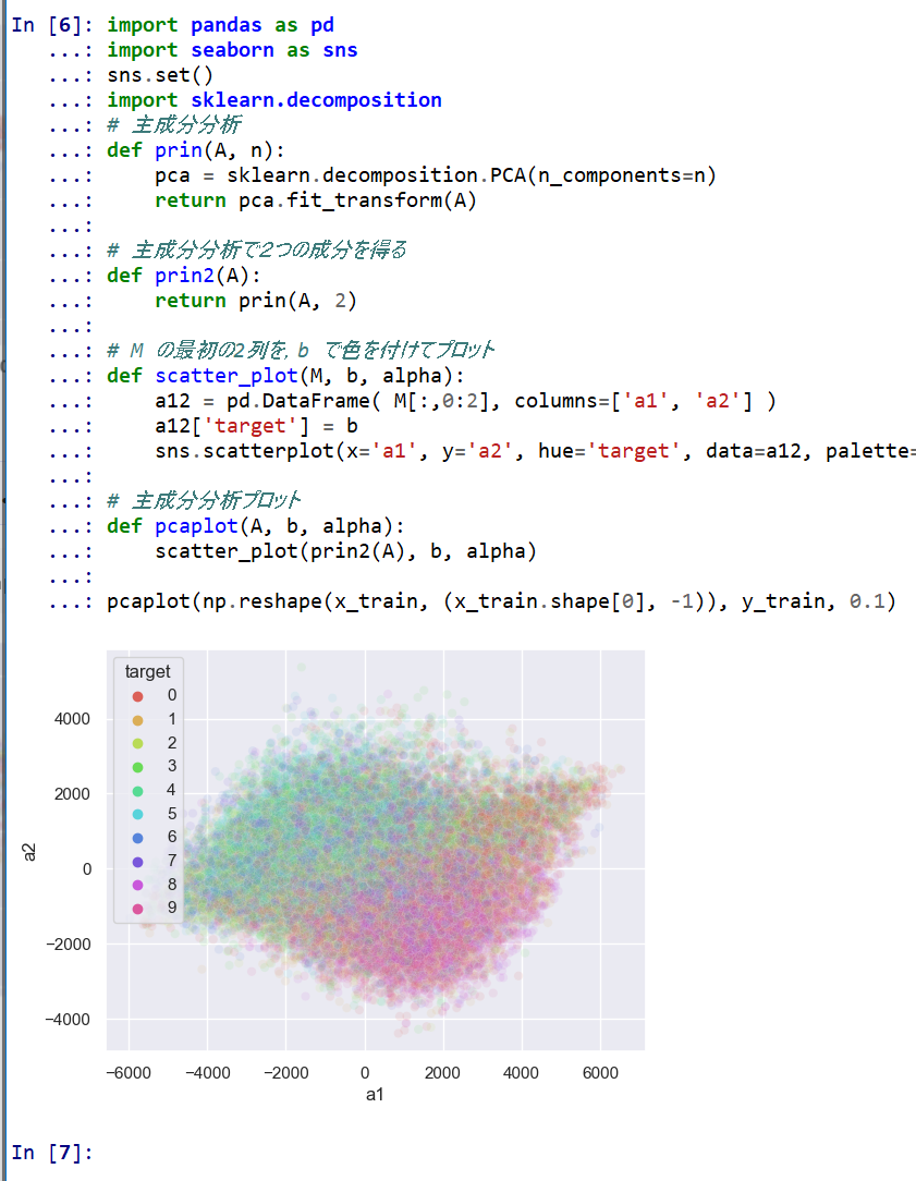
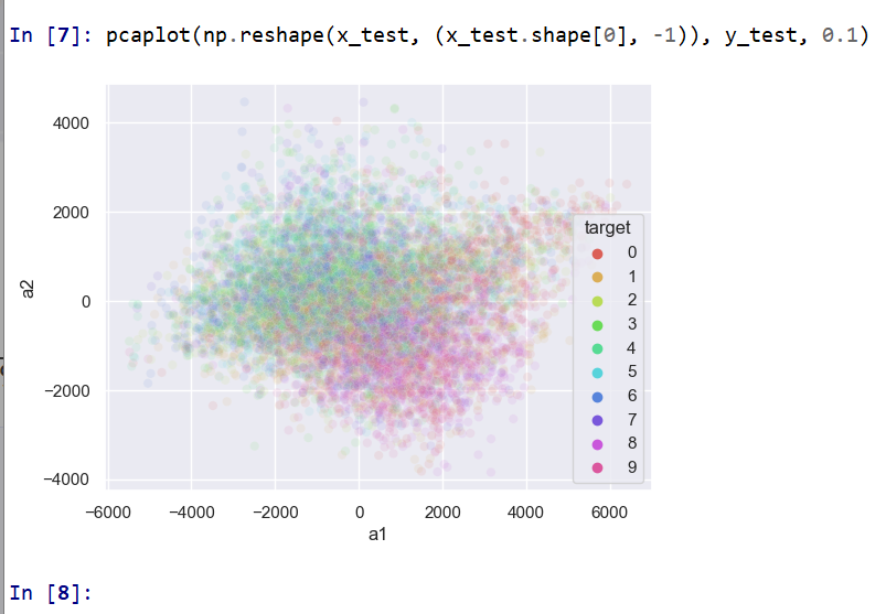
pcaplot(np.reshape(x_test, (x_test.shape[0], -1)), y_test, 0.1)
Keras を用いたニューラルネットワークの作成
- x_train, x_test, y_train, y_test の numpy ndarray への変換と,値の範囲の調整(値の範囲が 0 〜 255 であるのを,0 〜 1 に調整)
x_train = x_train.numpy().astype("float32") / 255.0
x_test = x_test.numpy().astype("float32") / 255.0
y_train = y_train.numpy()
y_test = y_test.numpy()
print(type(x_train), x_train.shape, np.max(x_train), np.min(x_train))
print(type(x_test), x_test.shape, np.max(x_test), np.min(x_test))
print(type(y_train), y_train.shape, np.max(y_train), np.min(y_train))
print(type(y_test), y_test.shape, np.max(y_test), np.min(y_test))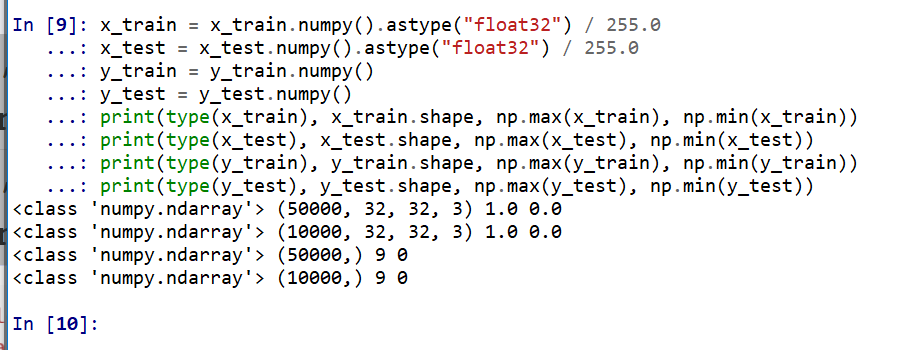
- データの確認表示
MatplotLib を用いて,複数の画像を並べて表示する.
plt.style.use('default')
plt.figure(figsize=(10,10))
for i in range(25):
  plt.subplot(5,5,i+1)
  plt.xticks([])
  plt.yticks([])
  plt.grid(False)
  plt.imshow(x_train[i], cmap=plt.cm.binary)
  plt.xlabel(y_train[i])

plt.show()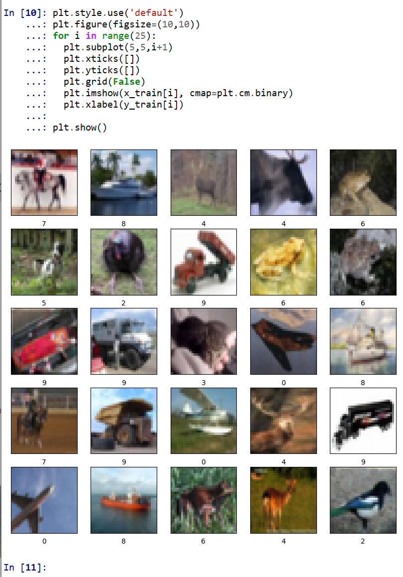
- ニューラルネットワークの作成
- Conv2DとMaxPooling2D層を使用して画像から特徴を抽出
- Flatten を使用して平坦化
- Dense を用いて分類
num_classes = 10
input_shape = (32, 32, 3)
m = tf.keras.Sequential(
    [
        tf.keras.Input(shape=input_shape),
        layers.Conv2D(32, kernel_size=(3, 3), activation='relu'),
        layers.MaxPooling2D(pool_size=(2, 2)),
        layers.Conv2D(64, kernel_size=(3, 3), activation='relu'),
        layers.MaxPooling2D(pool_size=(2, 2)),
        layers.Flatten(),
        layers.Dense(units=32, activation='relu'),
        layers.Dropout(0.5),
        layers.Dense(units=num_classes, activation='softmax')
    ]
)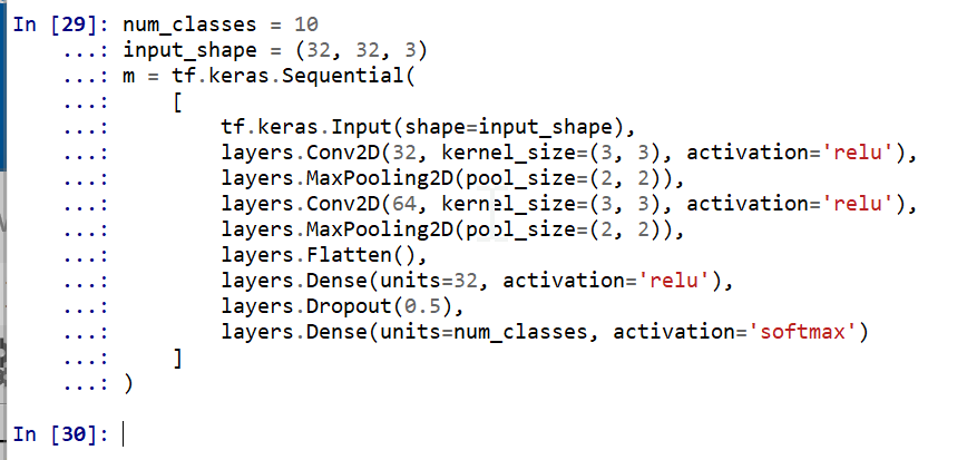
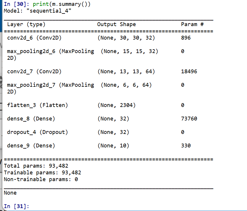
- ニューラルネットワークの確認表示
print(m.summary())
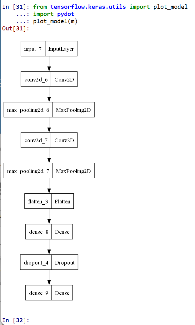
- モデルのビジュアライズ
Keras のモデルのビジュアライズについては: https://keras.io/ja/visualization/
ここでの表示で,エラーメッセージが出る場合でも,モデル自体は問題なくできていると考えられる.続行する.
from tensorflow.keras.utils import plot_model
import pydot
plot_model(m)
ニューラルネットワークの学習と検証
- ニューラルネットワークの学習を行う
ニューラルネットワークの学習は fit メソッドにより行う. 教師データを使用する.
EPOCHS = 50
m.compile(optimizer=tf.keras.optimizers.Adam(learning_rate=0.001),
              loss='sparse_categorical_crossentropy',
              metrics=['accuracy'])
history = m.fit(x_train, y_train, validation_data=(x_test, y_test), verbose=2, epochs=EPOCHS)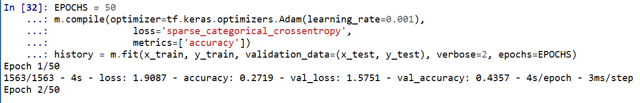
SGD を使う場合のプログラム例
m.compile(optimizer=tf.keras.optimizers.SGD(lr=0.01, momentum=0.9, nesterov=True), loss='sparse_categorical_crossentropy', metrics=['accuracy']) history = m.fit(x_train, y_train, validation_data=(x_test, y_test), verbose=2, epochs=EPOCHS) - ディープラーニングによるデータの分類
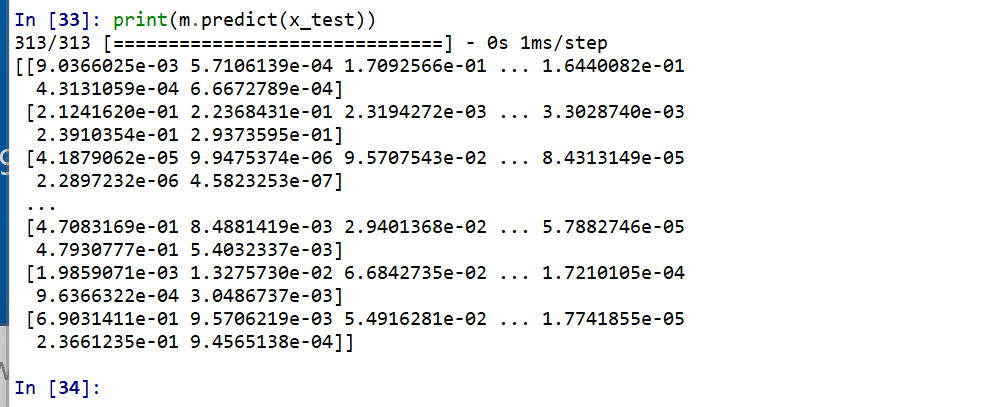
x_test を分類してみる.
print(m.predict(x_test))
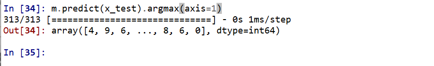
それぞれの数値の中で、一番大きいものはどれか?
m.predict(x_test).argmax(axis=1)
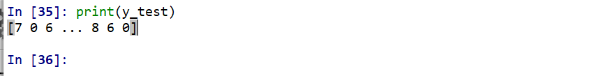
y_test 内にある正解のラベル(クラス名)を表示する(上の結果と比べるため)
print(y_test)
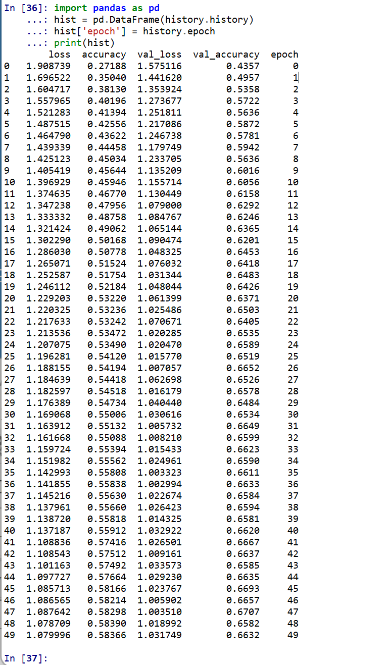
- 学習曲線の確認
過学習や学習不足について確認.
import pandas as pd
hist = pd.DataFrame(history.history)
hist['epoch'] = history.epoch
print(hist)
- 学習曲線のプロット
【関連する外部ページ】 訓練の履歴の可視化については,https://keras.io/ja/visualization/
- 学習時と検証時の,損失の違い
acc = history.history['accuracy']
val_acc = history.history['val_accuracy']
loss = history.history['loss']
val_loss = history.history['val_loss']

epochs = range(1, len(acc) + 1)

# "bo" は青いドット
plt.plot(epochs, loss, 'bo', label='Training loss')
# ”b" は青い実線
plt.plot(epochs, val_loss, 'b', label='Validation loss')
plt.title('Training and validation loss')
plt.xlabel('Epochs')
plt.ylabel('Loss')
plt.legend()

plt.show()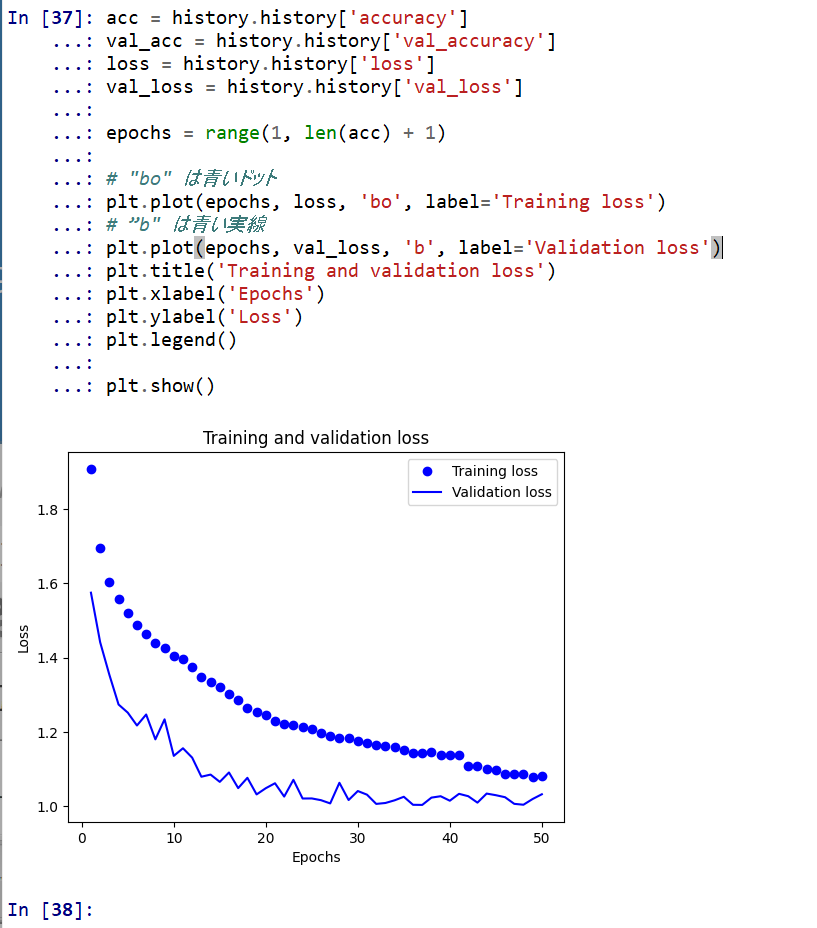
- 学習時と検証時の,精度の違い
acc = history.history['accuracy']
val_acc = history.history['val_accuracy']
loss = history.history['loss']
val_loss = history.history['val_loss']

plt.clf()   # 図のクリア
plt.plot(epochs, acc, 'bo', label='Training acc')
plt.plot(epochs, val_acc, 'b', label='Validation acc')
plt.title('Training and validation accuracy')
plt.xlabel('Epochs')
plt.ylabel('Accuracy')
plt.legend()

plt.show()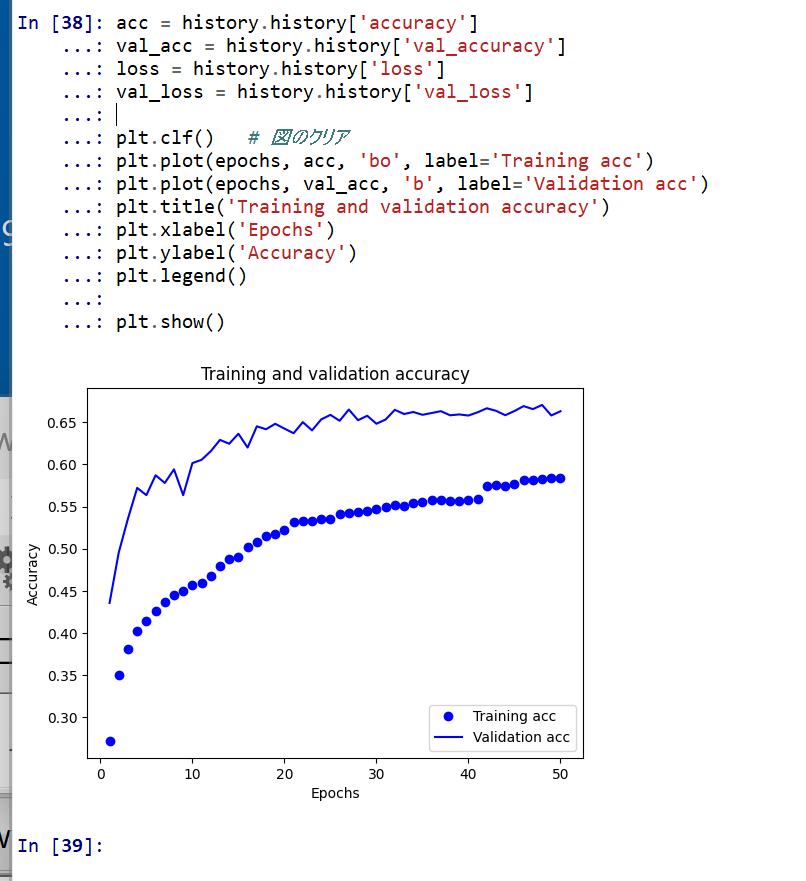
- 学習時と検証時の,損失の違い