3次元ボクセルデータの Python 実現ガイド
【サイト内のPython関連主要ページ】
- Windows AI支援Python開発環境構築ガイド: 別ページ »で説明
- AIエディタ Windsurf の活用: 別ページ »で説明
- AIエディタCursorガイド: 別ページ »で説明
- Google Colaboratory: 別ページ »で説明
- Python(Google Colaboratoryを含む)のまとめ: 別ページ »で説明
- 機械学習の Python 実現ガイド: 別ページ »で説明
- 行列計算の Python 実現ガイド: 別ページ »で説明
- 統計分析のPython での実現ガイド: 別ページ »で説明
- 音声信号処理の Python 実現ガイド: 別ページ »で説明
- カラー画像処理の Python 実現ガイド: 別ページ »で説明
- Pythonによる簡単なアドベンチャーゲーム(変数,式,if,while,関数,print,time.sleep, def, global を使用): 別ページ »で説明
- Pythonプログラミング講座:基礎から応用まで(授業資料,全15回): 別ページ »で説明
- Pythonプログラミングの例と実践ガイド: 別ページ »で説明
【外部リソース】
- Pythonの公式サイト: https://www.python.org
- 東京大学の「Pythonプログラミング入門」: https://utokyo-ipp.github.io/IPP_textbook.pdf
- ITmedia社の「Pythonチートシート」の記事: https://atmarkit.itmedia.co.jp/ait/articles/2004/20/news015.html
3次元ボクセルデータの可視化
第1章 データセットの選定
本節では、3次元ボクセルデータの可視化を学ぶ。ボクセル(voxel)とは、2次元画像におけるピクセル(pixel)を3次元に拡張した概念であり、3次元空間を格子状に分割した際の最小単位である。ここでは、コンピュータグラフィックス分野で広く利用されているベンチマークデータを使用する。
使用するデータは、The Stanford Volume Data Archive が公開している「CT Study of a Female Cadaver Head」(通称 CThead)である。このデータセットは、人体頭部のCTスキャン画像であり、医用画像処理やボリュームレンダリング(3次元データを直接画像化する手法)の研究で標準的に用いられている。
データの仕様
| 項目 | 内容 |
|---|---|
| データ名 | CT Study of a Female Cadaver Head ("CThead") |
| 公開元 | http://graphics.stanford.edu/data/voldata/ |
| 解像度 | 256 × 256 × 113 voxels |
| データ型 | 16-bit integer(Big Endian:上位バイトが先頭に格納される形式) |
| 形式 | スライス(断層)ごとのRawバイナリファイル113個を .tar.gz 形式で圧縮 |
2. Pythonプログラムの概要
本プログラムは、以下の3つの工程を自動的に実行する。
工程1:データ取得
Stanfordのサーバーからデータをダウンロードし、メモリ上で展開する。
工程2:データ変換
アーカイブ内のスライス画像を順序通りに並べ替え、積み重ねる(Stack)ことで3次元配列(NumPy Array)へ変換する。
工程3:可視化
変換したデータを2種類の方法で可視化する。
- 断層表示(Slices):医療診断と同様に、3つの断面(Axial:水平断、Coronal:冠状断、Sagittal:矢状断)を表示する。
- 3D等値面表示(Isosurface):骨(level=800)と皮膚(level=400)の2つの等値面を同一空間に重ねて描画することで、内部構造と外形を同時に観察できる。処理を軽量化するため、ボクセルを間引いて表示する。
3. 実行結果
プログラムを実行すると、以下の2つのウィンドウが表示される。
Figure 1:断層像(Slices)
3次元配列を特定の軸で切り出した画像である。CTやMRI診断において医師が観察する映像と同等のものである。
Figure 2:3D等値面(Bone + Skin)
Marching Cubesアルゴリズム(ボクセルデータから等値面のポリゴンメッシュを生成する標準的手法)により、特定の密度(濃淡値)を持つ場所をつなぎ合わせ、立体的な「殻」として抽出した結果である。
本プログラムでは、骨(level=800)と皮膚(level=400)の2つの等値面を同一の3D空間に重ねて表示する。骨は白色で不透明寄りに、皮膚は肌色で半透明に設定することで、内部構造と外形を同時に観察できる。
なお、操作の軽快さを優先するため、step_size=10(10ボクセルごとに1つをサンプリング)で生成している。そのため、形状はやや粗く表示される。
4. 解説
4.1 データ構造
ダウンロードしたデータには、1枚の断層画像(256 × 256ピクセル)が113枚、個別のファイルとして格納されている。これらを np.stack 関数で縦方向に積み重ねることにより、(113, 256, 256) という形状の3次元配列を構築する。この配列は「高さ・奥行き・幅」を持つ直方体のボリュームデータを表現している。
4.2 可視化の原理
スライス表示
3次元の直方体データを、包丁で切るように特定の平面で切断し、その断面のピクセル値を2次元画像として表示する手法である。
等値面(Isosurface)
天気図における「等圧線」の3次元版と考えるとわかりやすい。等圧線が同じ気圧の地点を線で結んだものであるように、等値面は同じ密度の地点を面でつなげたものである。
例えば「密度が800の場所」をすべてつなげると、骨の形状が立体的に浮かび上がる。ただし、そのままではデータ量が膨大になり、回転などのインタラクティブな操作が重くなる。そのため、データを間引いてポリゴン数を削減する最適化を行っている。
複数等値面の同時表示
閾値を変えることで、異なる組織を抽出できる。骨は高い密度値(約800)、皮膚や軟部組織は低い密度値(約400)を持つ。これらを異なる透明度と色で同一空間に描画することで、外形と内部構造の関係を直感的に把握できる。
5. Pythonコード
import numpy as np
import matplotlib.pyplot as plt
from matplotlib.widgets import Slider
from mpl_toolkits.mplot3d.art3d import Poly3DCollection
from skimage import measure
import requests
import tarfile
import io

# ==========================================
# 1. Data Loading
# ==========================================

url = "http://graphics.stanford.edu/data/voldata/CThead.tar.gz"
response = requests.get(url)

with tarfile.open(fileobj=io.BytesIO(response.content), mode="r:gz") as tar:
    slice_size = 256 * 256 * 2
    members = sorted(
        [m for m in tar.getmembers() if m.size == slice_size],
        key=lambda m: m.name
    )

    slices = []
    for m in members:
        f = tar.extractfile(m)
        chunk = np.frombuffer(f.read(), dtype='>u2')
        slices.append(chunk.reshape((256, 256)))

    volume = np.stack(slices, axis=0)

# ==========================================
# 2. Visualization
# ==========================================

z, y, x = volume.shape

# --- Figure 1: Interactive Slice Viewer ---
fig1, ax1 = plt.subplots(figsize=(8, 8))
fig1.canvas.manager.set_window_title('Figure 1: Interactive Slice Viewer')
plt.subplots_adjust(bottom=0.15)

img = ax1.imshow(volume[z // 2, :, :], cmap='gray')
ax1.set_title(f'Axial Slice: {z // 2}')
ax1.axis('off')

ax_slider = plt.axes([0.2, 0.05, 0.6, 0.03])
slider = Slider(ax_slider, 'Slice', 0, z - 1, valinit=z // 2, valstep=1)

def update(val):
    idx = int(slider.val)
    img.set_data(volume[idx, :, :])
    ax1.set_title(f'Axial Slice: {idx}')
    fig1.canvas.draw_idle()

slider.on_changed(update)

# --- Figure 2: Multiple Isosurfaces ---
fig2 = plt.figure(figsize=(10, 8))
fig2.canvas.manager.set_window_title('Figure 2: Bone + Skin')
ax = fig2.add_subplot(111, projection='3d')

# 骨(白、不透明寄り)
verts_bone, faces_bone, _, _ = measure.marching_cubes(volume, level=800, step_size=10)
mesh_bone = Poly3DCollection(verts_bone[faces_bone], alpha=0.6)
mesh_bone.set_facecolor([0.9, 0.9, 0.9])
ax.add_collection3d(mesh_bone)

# 皮膚(肌色、半透明)
verts_skin, faces_skin, _, _ = measure.marching_cubes(volume, level=400, step_size=10)
mesh_skin = Poly3DCollection(verts_skin[faces_skin], alpha=0.15)
mesh_skin.set_facecolor([0.9, 0.7, 0.6])
ax.add_collection3d(mesh_skin)

ax.set_xlim(0, x)
ax.set_ylim(0, y)
ax.set_zlim(0, z)
ax.set_title("Bone (white) + Skin (transparent)")

plt.show()
第2章 畳み込み(Convolution)
2.1 概要
畳み込みは、カーネル(kernel)と呼ばれる小さな配列を入力データ上で滑らせながら、対応する要素同士を掛け合わせて合計する演算である。本プログラムでは、11×11×11の平均化カーネルを使用する。各ボクセルを周囲1331個のボクセルの平均値で置き換えることで、画像が明確にぼける。
上段に元画像、下段に畳み込み適用後の画像を表示する。
2.2 Pythonコード
import numpy as np
import matplotlib.pyplot as plt
from scipy import ndimage
import requests
import tarfile
import io

# ==========================================
# 1. Data Loading
# ==========================================

url = "http://graphics.stanford.edu/data/voldata/CThead.tar.gz"
response = requests.get(url)

with tarfile.open(fileobj=io.BytesIO(response.content), mode="r:gz") as tar:
    slice_size = 256 * 256 * 2
    members = sorted(
        [m for m in tar.getmembers() if m.size == slice_size],
        key=lambda m: m.name
    )

    slices = []
    for m in members:
        f = tar.extractfile(m)
        chunk = np.frombuffer(f.read(), dtype='>u2')
        slices.append(chunk.reshape((256, 256)))

    volume = np.stack(slices, axis=0).astype(np.float32)

# ==========================================
# 2. Convolution (11x11x11 Averaging Kernel)
# ==========================================

kernel = np.ones((11, 11, 11)) / (11 * 11 * 11)
convolved = ndimage.convolve(volume, kernel)

# ==========================================
# 3. Visualization
# ==========================================

z, y, x = volume.shape

fig, axes = plt.subplots(2, 3, figsize=(15, 10))
fig.canvas.manager.set_window_title('Convolution (11x11x11 Averaging)')

axes[0, 0].imshow(volume[z // 2, :, :], cmap='gray')
axes[0, 0].set_title('Original: Axial')
axes[0, 0].axis('off')

axes[0, 1].imshow(volume[:, y // 2, :], cmap='gray', origin='lower')
axes[0, 1].set_title('Original: Coronal')
axes[0, 1].axis('off')

axes[0, 2].imshow(volume[:, :, x // 2], cmap='gray', origin='lower')
axes[0, 2].set_title('Original: Sagittal')
axes[0, 2].axis('off')

axes[1, 0].imshow(convolved[z // 2, :, :], cmap='gray')
axes[1, 0].set_title('Convolved: Axial')
axes[1, 0].axis('off')

axes[1, 1].imshow(convolved[:, y // 2, :], cmap='gray', origin='lower')
axes[1, 1].set_title('Convolved: Coronal')
axes[1, 1].axis('off')

axes[1, 2].imshow(convolved[:, :, x // 2], cmap='gray', origin='lower')
axes[1, 2].set_title('Convolved: Sagittal')
axes[1, 2].axis('off')

plt.tight_layout()
plt.show()
第3章 勾配(Gradient)
3.1 概要
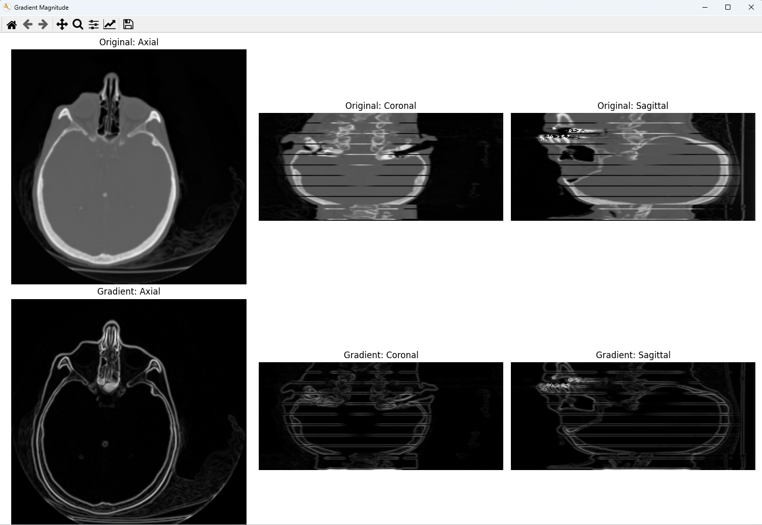
勾配は、各点における輝度値の変化率を表すベクトルである。3次元データでは、x・y・z各軸方向の偏微分を計算し、その大きさ(magnitude)を求めることで、輝度変化の激しさを可視化できる。
上段に元画像、下段に勾配の大きさを表示する。元画像では組織全体が見えるのに対し、勾配画像では境界のみが白く浮かび上がる。
3.2 Pythonコード
import numpy as np
import matplotlib.pyplot as plt
import requests
import tarfile
import io

# ==========================================
# 1. Data Loading
# ==========================================

url = "http://graphics.stanford.edu/data/voldata/CThead.tar.gz"
response = requests.get(url)

with tarfile.open(fileobj=io.BytesIO(response.content), mode="r:gz") as tar:
    slice_size = 256 * 256 * 2
    members = sorted(
        [m for m in tar.getmembers() if m.size == slice_size],
        key=lambda m: m.name
    )

    slices = []
    for m in members:
        f = tar.extractfile(m)
        chunk = np.frombuffer(f.read(), dtype='>u2')
        slices.append(chunk.reshape((256, 256)))

    volume = np.stack(slices, axis=0).astype(np.float32)

# ==========================================
# 2. Gradient Magnitude
# ==========================================

gz, gy, gx = np.gradient(volume)
gradient_mag = np.sqrt(gx**2 + gy**2 + gz**2)

# ==========================================
# 3. Visualization
# ==========================================

z, y, x = volume.shape

fig, axes = plt.subplots(2, 3, figsize=(15, 10))
fig.canvas.manager.set_window_title('Gradient Magnitude')

axes[0, 0].imshow(volume[z // 2, :, :], cmap='gray')
axes[0, 0].set_title('Original: Axial')
axes[0, 0].axis('off')

axes[0, 1].imshow(volume[:, y // 2, :], cmap='gray', origin='lower')
axes[0, 1].set_title('Original: Coronal')
axes[0, 1].axis('off')

axes[0, 2].imshow(volume[:, :, x // 2], cmap='gray', origin='lower')
axes[0, 2].set_title('Original: Sagittal')
axes[0, 2].axis('off')

axes[1, 0].imshow(gradient_mag[z // 2, :, :], cmap='gray')
axes[1, 0].set_title('Gradient: Axial')
axes[1, 0].axis('off')

axes[1, 1].imshow(gradient_mag[:, y // 2, :], cmap='gray', origin='lower')
axes[1, 1].set_title('Gradient: Coronal')
axes[1, 1].axis('off')

axes[1, 2].imshow(gradient_mag[:, :, x // 2], cmap='gray', origin='lower')
axes[1, 2].set_title('Gradient: Sagittal')
axes[1, 2].axis('off')

plt.tight_layout()
plt.show()
第4章 補間(Interpolation)
4.1 概要
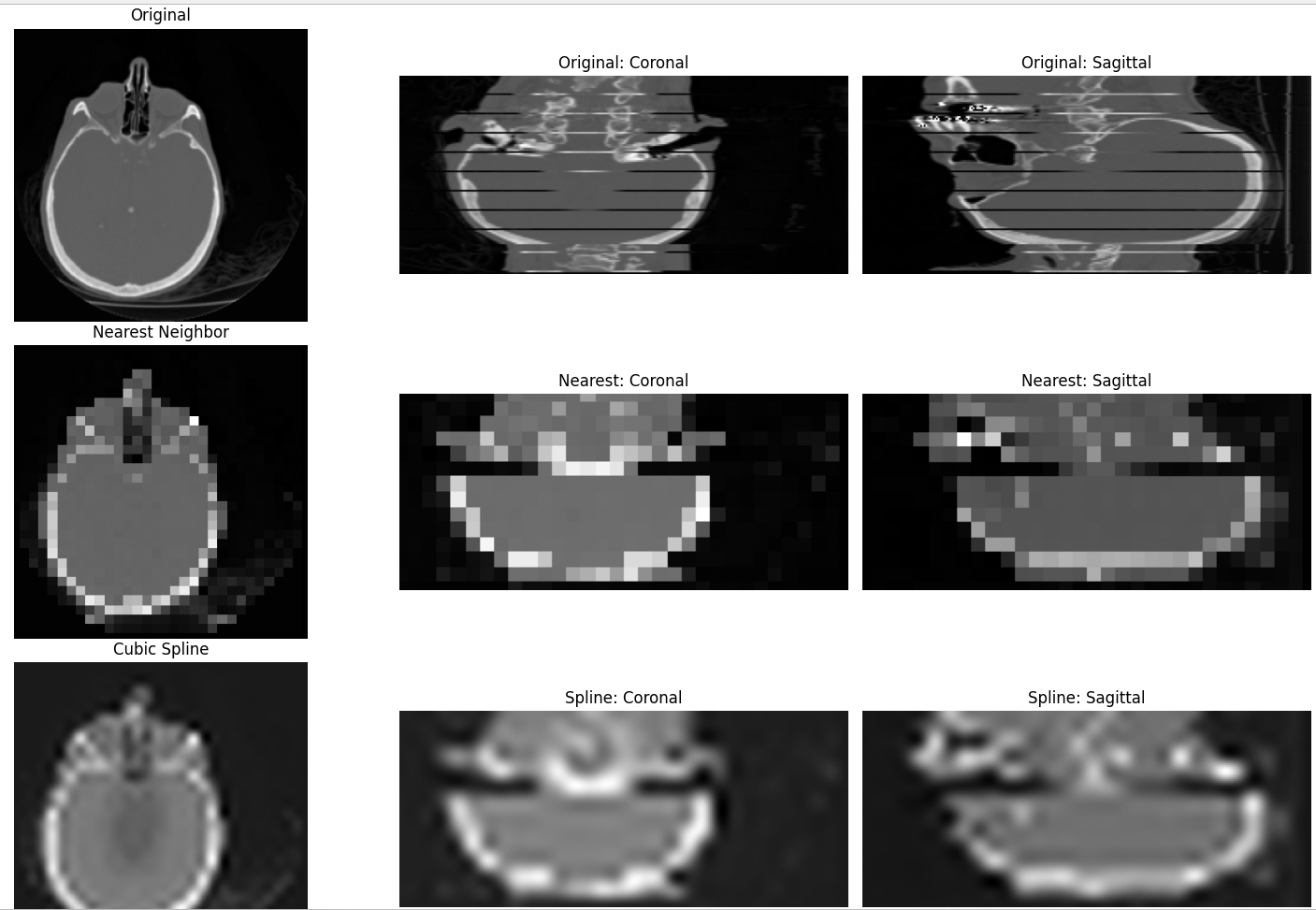
補間は、離散的なデータ点の間を滑らかにつなぎ、解像度を変更する処理である。本プログラムでは、データを1/8に縮小した後、8倍に拡大して元サイズに戻す。最近傍補間(order=0)と3次スプライン補間(order=3)の結果を比較する。
上段に元画像、中段に最近傍補間、下段に3次スプライン補間を表示する。最近傍補間ではブロック状のギザギザが目立ち、スプライン補間では滑らかに復元されている。
4.2 Pythonコード
import numpy as np
import matplotlib.pyplot as plt
from scipy import ndimage
import requests
import tarfile
import io

# ==========================================
# 1. Data Loading
# ==========================================

url = "http://graphics.stanford.edu/data/voldata/CThead.tar.gz"
response = requests.get(url)

with tarfile.open(fileobj=io.BytesIO(response.content), mode="r:gz") as tar:
    slice_size = 256 * 256 * 2
    members = sorted(
        [m for m in tar.getmembers() if m.size == slice_size],
        key=lambda m: m.name
    )

    slices = []
    for m in members:
        f = tar.extractfile(m)
        chunk = np.frombuffer(f.read(), dtype='>u2')
        slices.append(chunk.reshape((256, 256)))

    volume = np.stack(slices, axis=0).astype(np.float32)

# ==========================================
# 2. Interpolation Comparison
# ==========================================

downscaled = ndimage.zoom(volume, 0.125, order=0)
upscaled_nearest = ndimage.zoom(downscaled, 8.0, order=0)
upscaled_spline = ndimage.zoom(downscaled, 8.0, order=3)

# ==========================================
# 3. Visualization
# ==========================================

z, y, x = volume.shape

fig, axes = plt.subplots(3, 3, figsize=(15, 15))
fig.canvas.manager.set_window_title('Interpolation Comparison')

axes[0, 0].imshow(volume[z // 2, :, :], cmap='gray')
axes[0, 0].set_title('Original')
axes[0, 0].axis('off')

axes[0, 1].imshow(volume[:, y // 2, :], cmap='gray', origin='lower')
axes[0, 1].set_title('Original: Coronal')
axes[0, 1].axis('off')

axes[0, 2].imshow(volume[:, :, x // 2], cmap='gray', origin='lower')
axes[0, 2].set_title('Original: Sagittal')
axes[0, 2].axis('off')

axes[1, 0].imshow(upscaled_nearest[z // 2, :, :], cmap='gray')
axes[1, 0].set_title('Nearest Neighbor')
axes[1, 0].axis('off')

axes[1, 1].imshow(upscaled_nearest[:, y // 2, :], cmap='gray', origin='lower')
axes[1, 1].set_title('Nearest: Coronal')
axes[1, 1].axis('off')

axes[1, 2].imshow(upscaled_nearest[:, :, x // 2], cmap='gray', origin='lower')
axes[1, 2].set_title('Nearest: Sagittal')
axes[1, 2].axis('off')

axes[2, 0].imshow(upscaled_spline[z // 2, :, :], cmap='gray')
axes[2, 0].set_title('Cubic Spline')
axes[2, 0].axis('off')

axes[2, 1].imshow(upscaled_spline[:, y // 2, :], cmap='gray', origin='lower')
axes[2, 1].set_title('Spline: Coronal')
axes[2, 1].axis('off')

axes[2, 2].imshow(upscaled_spline[:, :, x // 2], cmap='gray', origin='lower')
axes[2, 2].set_title('Spline: Sagittal')
axes[2, 2].axis('off')

plt.tight_layout()
plt.show()
第5章 平滑化(Smoothing)

5.1 概要
平滑化は、データに含まれるノイズを低減する処理である。ガウシアンフィルタは、正規分布に基づく重み付け平均を計算する。パラメータσが大きいほど強くぼける。本プログラムではσ=10を使用する。
上段に元画像、下段に平滑化後の画像を表示する。細かな構造がぼやけ、主要な輪郭のみが残る。
5.2 Pythonコード
import numpy as np
import matplotlib.pyplot as plt
from scipy import ndimage
import requests
import tarfile
import io

# ==========================================
# 1. Data Loading
# ==========================================

url = "http://graphics.stanford.edu/data/voldata/CThead.tar.gz"
response = requests.get(url)

with tarfile.open(fileobj=io.BytesIO(response.content), mode="r:gz") as tar:
    slice_size = 256 * 256 * 2
    members = sorted(
        [m for m in tar.getmembers() if m.size == slice_size],
        key=lambda m: m.name
    )

    slices = []
    for m in members:
        f = tar.extractfile(m)
        chunk = np.frombuffer(f.read(), dtype='>u2')
        slices.append(chunk.reshape((256, 256)))

    volume = np.stack(slices, axis=0).astype(np.float32)

# ==========================================
# 2. Gaussian Smoothing
# ==========================================

sigma = 10
smoothed = ndimage.gaussian_filter(volume, sigma=sigma)

# ==========================================
# 3. Visualization
# ==========================================

z, y, x = volume.shape

fig, axes = plt.subplots(2, 3, figsize=(15, 10))
fig.canvas.manager.set_window_title(f'Gaussian Smoothing (sigma={sigma})')

axes[0, 0].imshow(volume[z // 2, :, :], cmap='gray')
axes[0, 0].set_title('Original: Axial')
axes[0, 0].axis('off')

axes[0, 1].imshow(volume[:, y // 2, :], cmap='gray', origin='lower')
axes[0, 1].set_title('Original: Coronal')
axes[0, 1].axis('off')

axes[0, 2].imshow(volume[:, :, x // 2], cmap='gray', origin='lower')
axes[0, 2].set_title('Original: Sagittal')
axes[0, 2].axis('off')

axes[1, 0].imshow(smoothed[z // 2, :, :], cmap='gray')
axes[1, 0].set_title(f'Smoothed (σ={sigma}): Axial')
axes[1, 0].axis('off')

axes[1, 1].imshow(smoothed[:, y // 2, :], cmap='gray', origin='lower')
axes[1, 1].set_title(f'Smoothed (σ={sigma}): Coronal')
axes[1, 1].axis('off')

axes[1, 2].imshow(smoothed[:, :, x // 2], cmap='gray', origin='lower')
axes[1, 2].set_title(f'Smoothed (σ={sigma}): Sagittal')
axes[1, 2].axis('off')

plt.tight_layout()
plt.show()