散布図,折れ線グラフ,ヒストグラムのバリエーション(R システム,ggplot2 を使用)
【関連する外部ページ】
【サイト内の関連ページ】
前準備
R システムのインストール
【関連する外部ページ】
R システムの CRAN の URL: https://cran.r-project.org/
ggplot2 のインストール
R システムで,次のコマンドを実行し,ggplot2 をインストールする.
このとき「Secure CRAN mirrors」のような,ミラーサイトの選択画面が出たときは「Japan」のものを選ぶ.
install.packages("ggplot2")
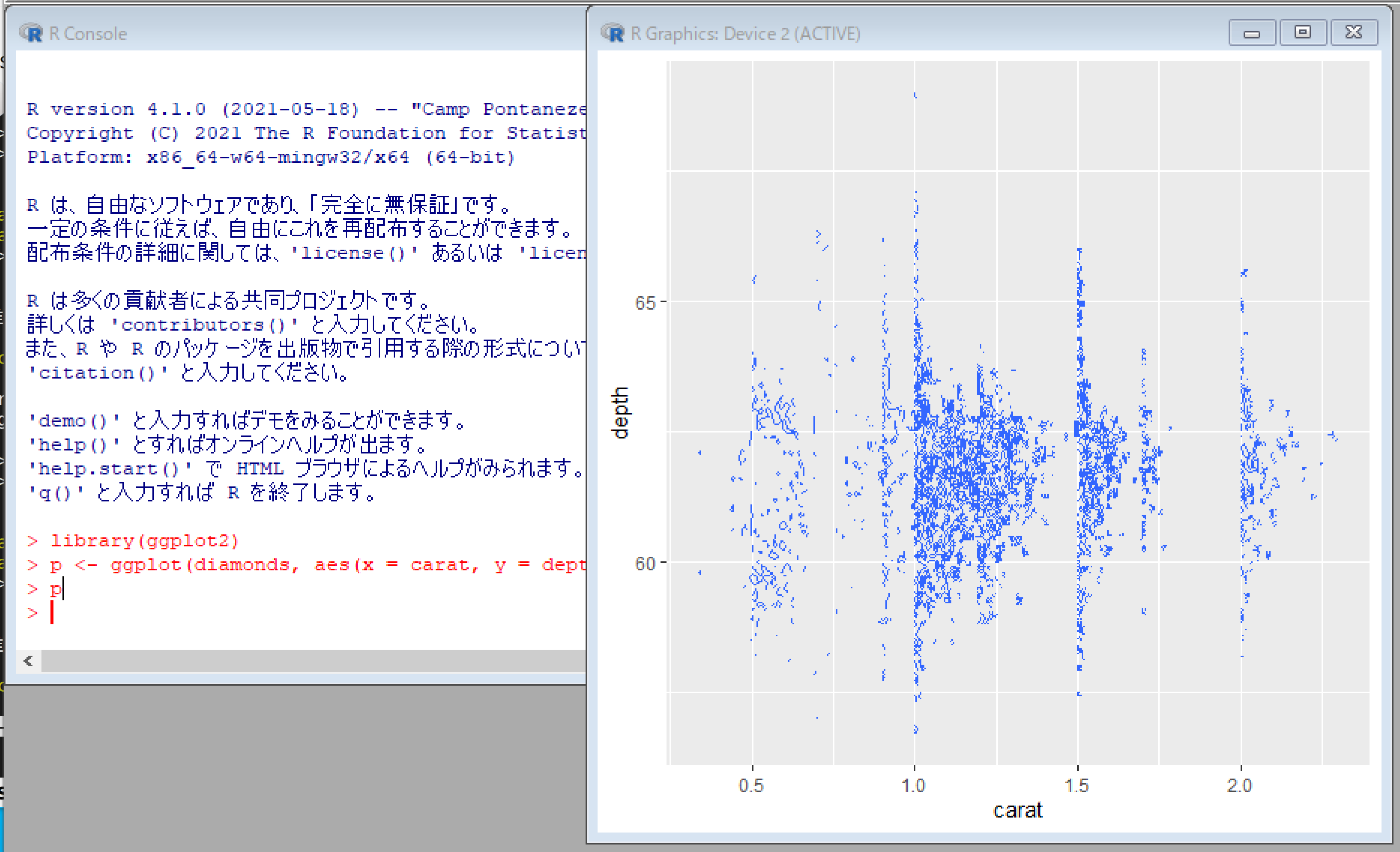
ggplot の散布図
geom_point の Aesthetics : x, y, alpha, colour, fill, shape, size
- 単純な散布図
library(ggplot2)
p <- ggplot(diamonds, aes(x = carat, y = price))
p + geom_point()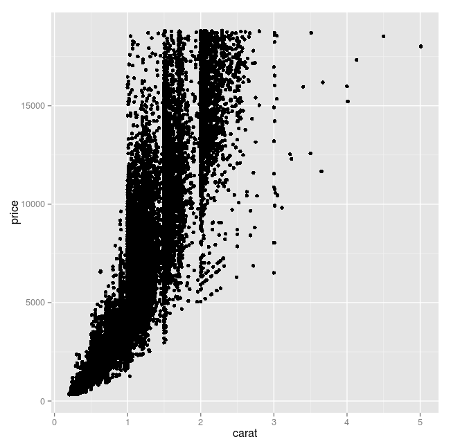
- x の範囲,y の範囲, x 軸ラベル, y 軸ラベル
element_text(size=15) は x 軸ラベル, y 軸ラベル, x軸目盛り, y軸目盛りのフォントサイズ
library(ggplot2)
p <- ggplot(diamonds, aes(x = carat, y = price))
p + geom_point() + xlim(0, 10) + ylim(0, 30000) + xlab("カラット") + ylab("価格") + theme(axis.title.x = element_text(size=24), axis.title.y = element_text(size=24), axis.text.x = element_text(size=24),axis.text.y = element_text(size=24))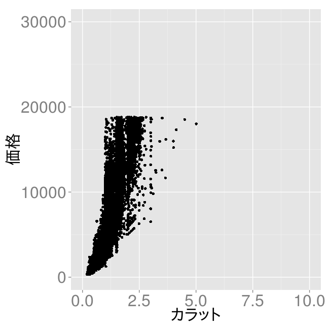
- 色付け
library(ggplot2)
p <- ggplot(diamonds, aes(x = carat, y = price))
p + geom_point( colour = "red", size = 3 )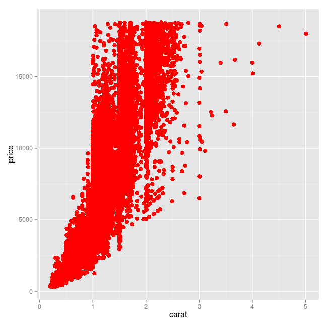
- 半透明
library(ggplot2)
p <- ggplot(diamonds, aes(x = carat, y = price))
p + geom_point( size = 3, alpha = 0.04 )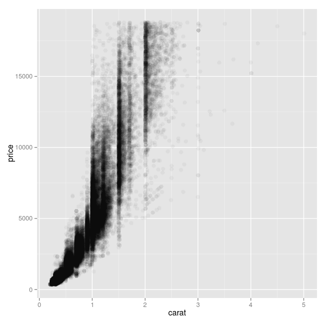
- factor 値による色の変化
geom_point の colour に factor を指定. scale_colour_hue() を追加.
library(ggplot2)
p <- ggplot(diamonds, aes(x = carat, y = price))
p + geom_point( aes(colour = color) ) + scale_colour_hue()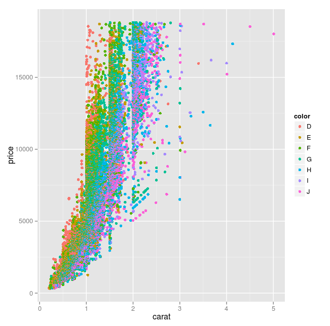
- 数値による色の変化
geom_point の colour に数値を指定. scale_colour_gradient(low = "cyan", high="magenta") を指定.※ colour に数式を書いても大丈夫(整数値でなくてもよい)
library(ggplot2)
p <- ggplot(diamonds, aes(x = carat, y = price))
p + geom_point( aes(colour = depth) ) + scale_colour_gradient(low = "cyan", high="magenta")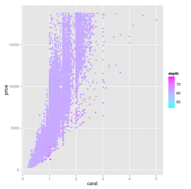
- factor 値による大きさの変化
geom_point の size に factor を指定
library(ggplot2)
p <- ggplot(diamonds, aes(x = carat, y = price))
p + geom_point( aes(size = color, colour = color), alpha = 0.5 ) + scale_colour_hue()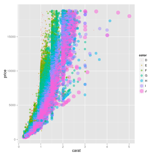
- 数値による大きさの変化
geom_point の size に数値を指定 ※ 数式を書いても大丈夫(整数値でなくてもよい)
library(ggplot2)
p <- ggplot(diamonds, aes(x = carat, y = price))
p + geom_point( aes(size = depth, colour = depth), alpha = 0.5 ) + scale_colour_gradient(low = "cyan", high="magenta")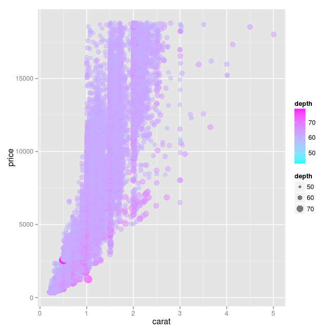
- factor 値による形の変化
geom_point の shape に factor を指定 ※ shape には整数値なら指定できる
library(ggplot2)
p <- ggplot(diamonds, aes(x = carat, y = price))
p + geom_point( aes(shape = color, colour = color), alpha = 0.5, size = 4 ) + scale_colour_hue()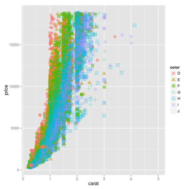
geom_point の shape に factor を指定.scale_shape を使う ※ shape には、整数値なら指定できる
library(ggplot2)
p <- ggplot(diamonds, aes(x = carat, y = price))
p + geom_point( aes(shape = color, colour = color), alpha = 0.5, size = 4 ) + scale_colour_hue() + scale_shape(solid = FALSE)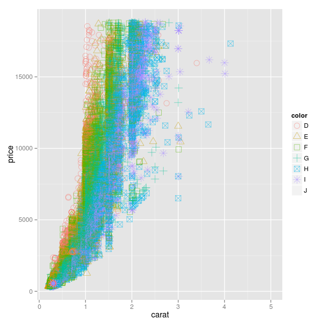
ggplot の折れ線グラフ
geom_line の Aesthetics : x, y, alpha, colour, linetype, size
- 単純な折れ線グラフ
<例1>
economics は ggplot2 パッケージ由来のデータ
library(ggplot2)
p <- ggplot(economics, aes(x = date, y = uempmed))
p + geom_line()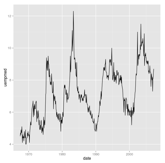
<例2>
Indometh は datasets パッケージ由来のデータ
library(ggplot2)
p <- ggplot(Indometh, aes(x = time, y = conc, colour=Subject))
p + geom_line()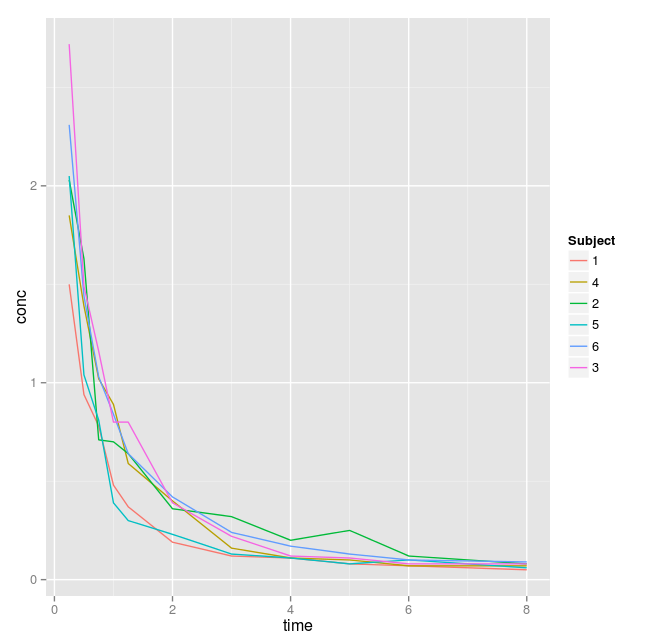
- x の範囲,y の範囲, x 軸ラベル, y 軸ラベル
element_text(size=24) は x 軸ラベル, y 軸ラベル, x軸目盛り, y軸目盛りのフォントサイズを変更するのに使うことができる
library(ggplot2)
p <- ggplot(economics, aes(x = date, y = uempmed)) + ylim(0, 15) + xlab("西暦年") + ylab("失業率") + theme(axis.title.x = element_text(size=24), axis.title.y = element_text(size=24), axis.text.x = element_text(size=24),axis.text.y = element_text(size=24))
p + geom_line()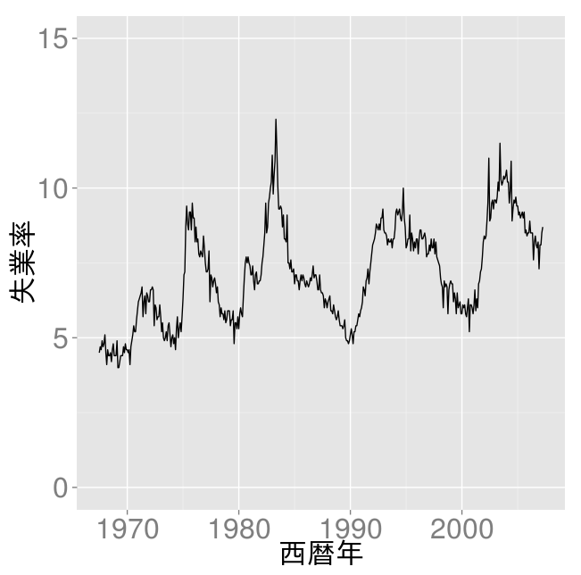
library(ggplot2)
p <- ggplot(Indometh, aes(x = time, y = conc, colour=Subject)) + ylim(0, 3) + xlab("conc") + ylab("時間") + theme(axis.title.x = element_text(size=24), axis.title.y = element_text(size=24), axis.text.x = element_text(size=24),axis.text.y = element_text(size=24))
p + geom_line()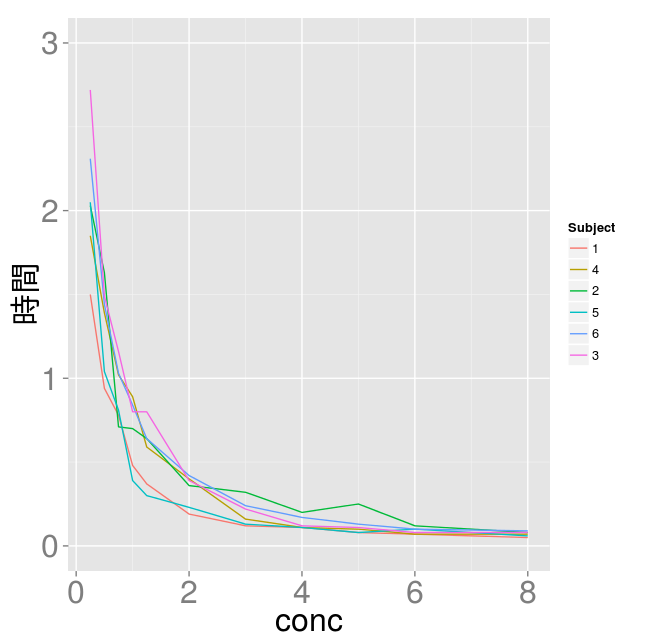
- 色付け
library(ggplot2)
p <- ggplot(economics, aes(x = date, y = uempmed))
p + geom_line( colour = "red", size = 3 )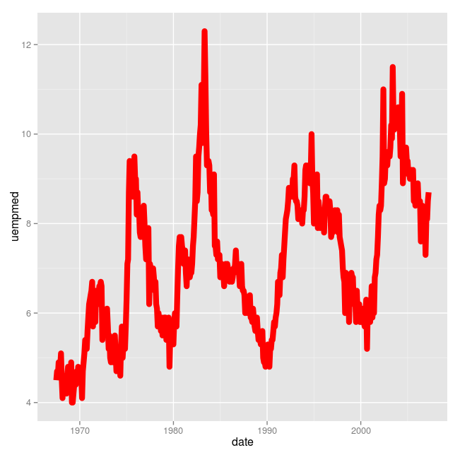
- 数値による色の変化
geom_point の colour に数値を指定. scale_colour_gradient(low = "cyan", high="magenta") を指定.※ colour に数式を書いても大丈夫(整数値でなくてもよい)
library(ggplot2)
p <- ggplot(economics, aes(x = date, y = uempmed) )
p + geom_line( aes(colour=uempmed) ) + scale_colour_gradient(low = "cyan", high="magenta")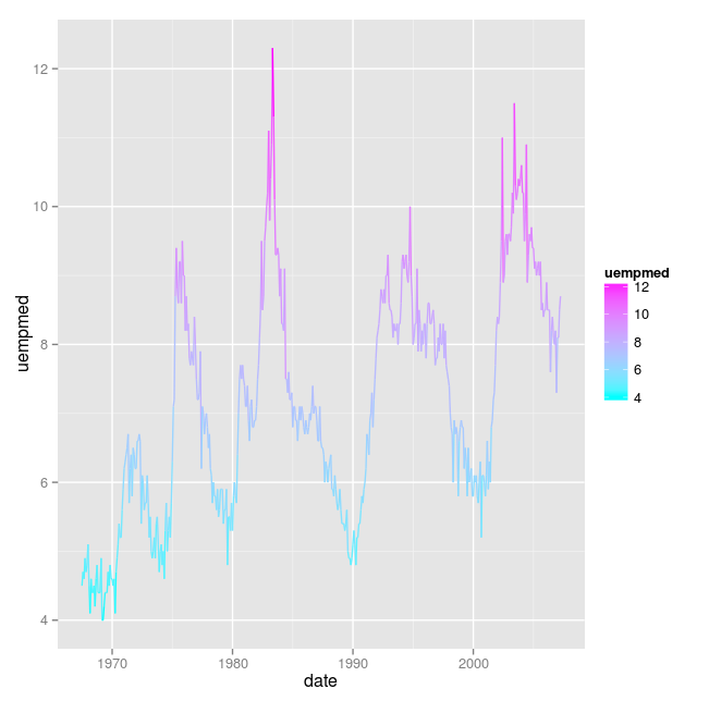
- factor による線種の変化
library(ggplot2)
p <- ggplot(Indometh, aes(x = time, y = conc, colour=Subject))
p + geom_line( aes( linetype = Subject ), size = 1 )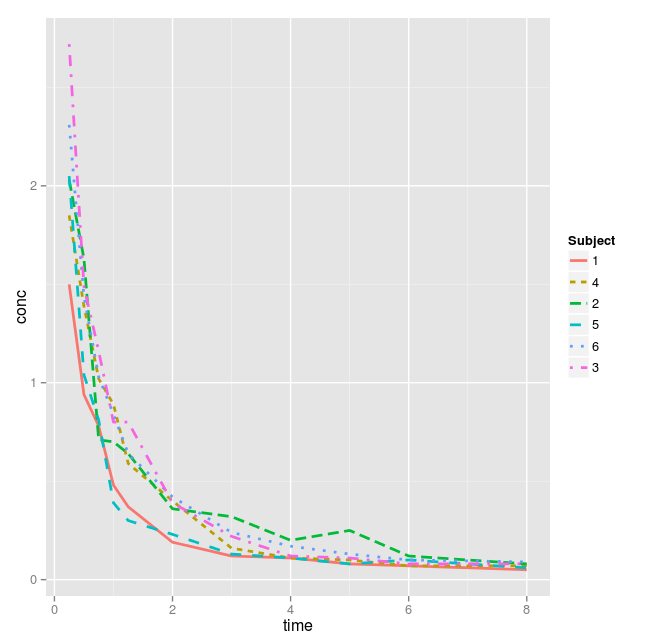
ggplot の経路のプロット
geom_path の Aesthetics : x, y, alpha, colour, linetype, size
- 経路プロット
seals は ggplot2 パッケージ由来のデータ
library(ggplot2)
p <- ggplot(data.frame(seals), aes(x = delta_lat, y = delta_long, colour = factor(long)))
p + geom_path()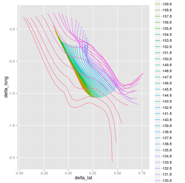
- x の範囲,y の範囲, x 軸ラベル, y 軸ラベル
element_text(size=24) は x 軸ラベル, y 軸ラベル, x軸目盛り, y軸目盛りのフォントサイズを変更するのに使うことができる
library(ggplot2)
p <- ggplot(data.frame(seals), aes(x = delta_lat, y = delta_long, colour = factor(long))) + xlim(-1.5, 1.5) + ylim(-1.5, 1.5) + xlab("緯度変化") + ylab("経度変化") + theme(axis.title.x = element_text(size=24), axis.title.y = element_text(size=24), axis.text.x = element_text(size=24),axis.text.y = element_text(size=24))
p + geom_path()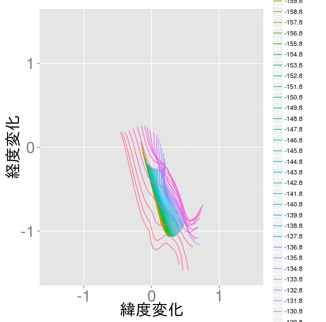
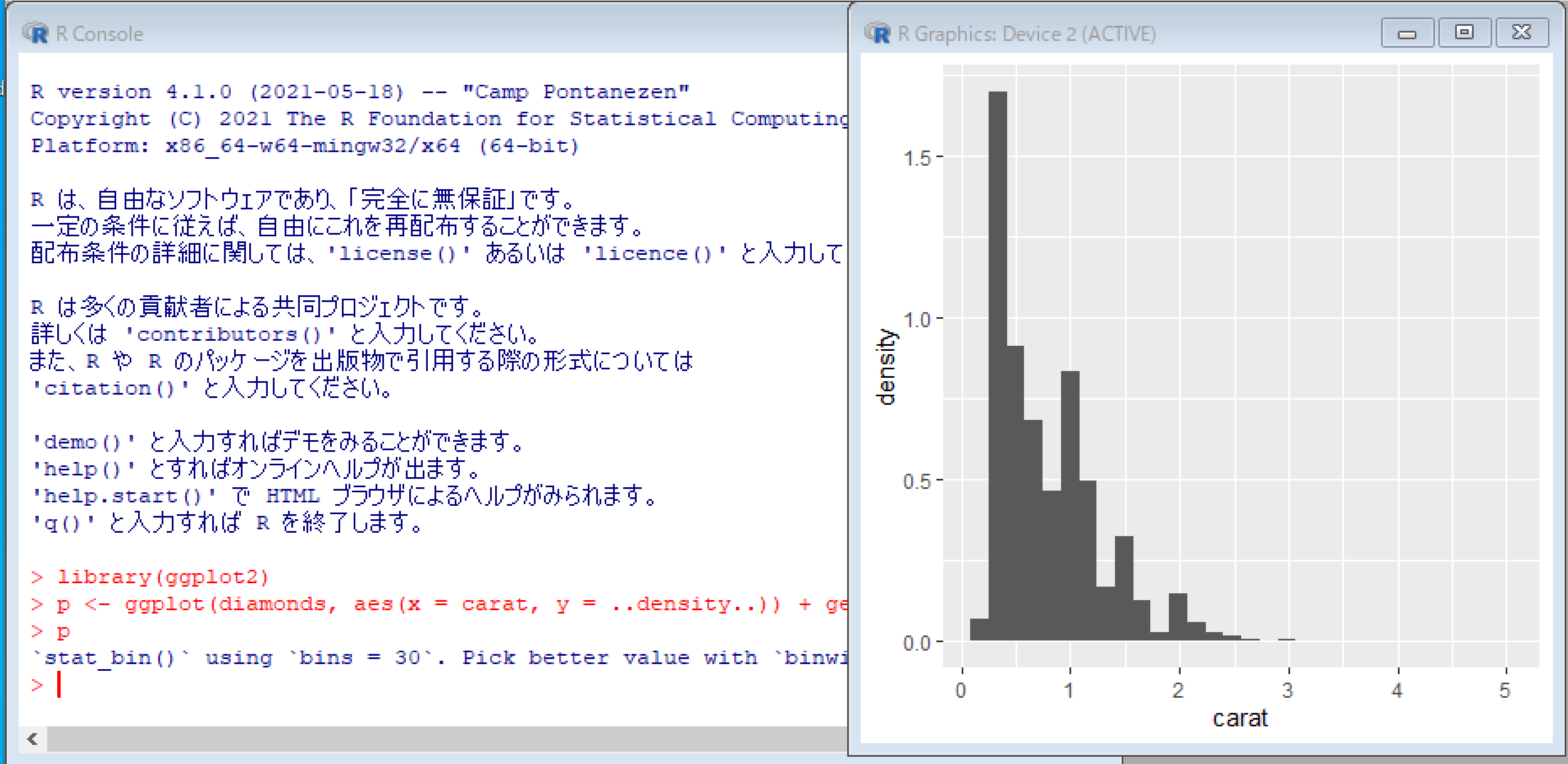
ヒストグラム
ヒストグラム
library(ggplot2)
p <- ggplot(diamonds, aes(x = carat, y = ..density..)) + geom_histogram()
p
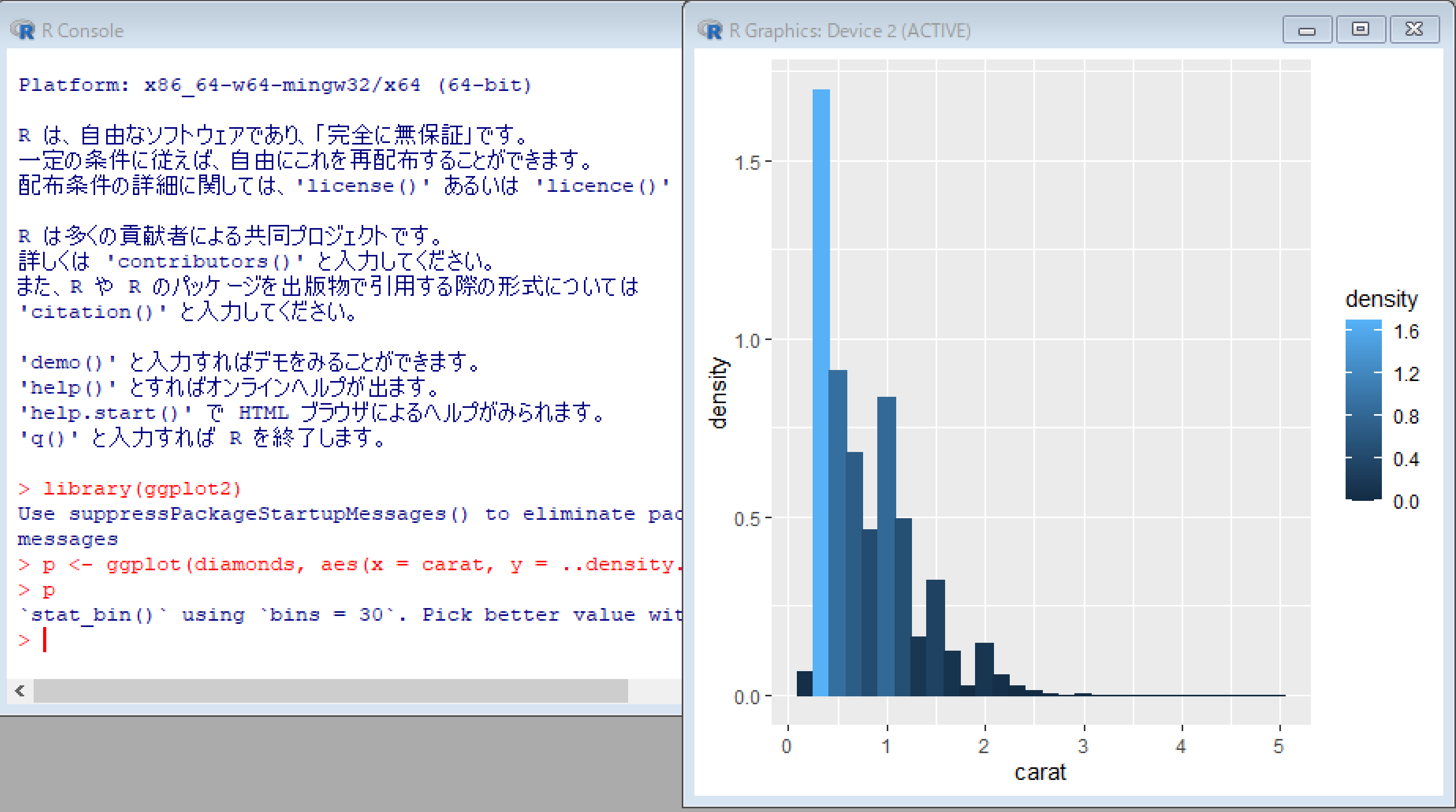
色分け
library(ggplot2)
p <- ggplot(diamonds, aes(x = carat, y = ..density..)) + geom_histogram( aes(colour = ..density.., fill = ..density..))
p
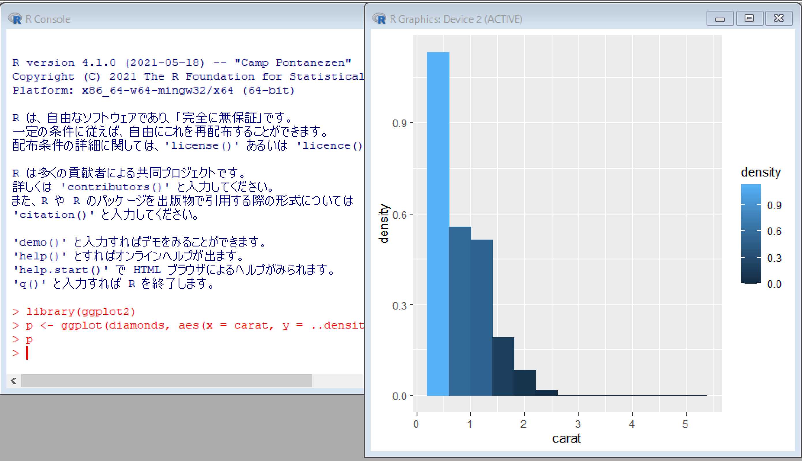
帯の幅指定
library(ggplot2)
p <- ggplot(diamonds, aes(x = carat, y = ..density..)) + geom_histogram( aes(colour = ..density.., fill = ..density..), binwidth=0.4 )
p
密度推定等高線
library(ggplot2)
p <- ggplot(diamonds, aes(x = carat, y = depth, z = price)) + geom_contour()
p
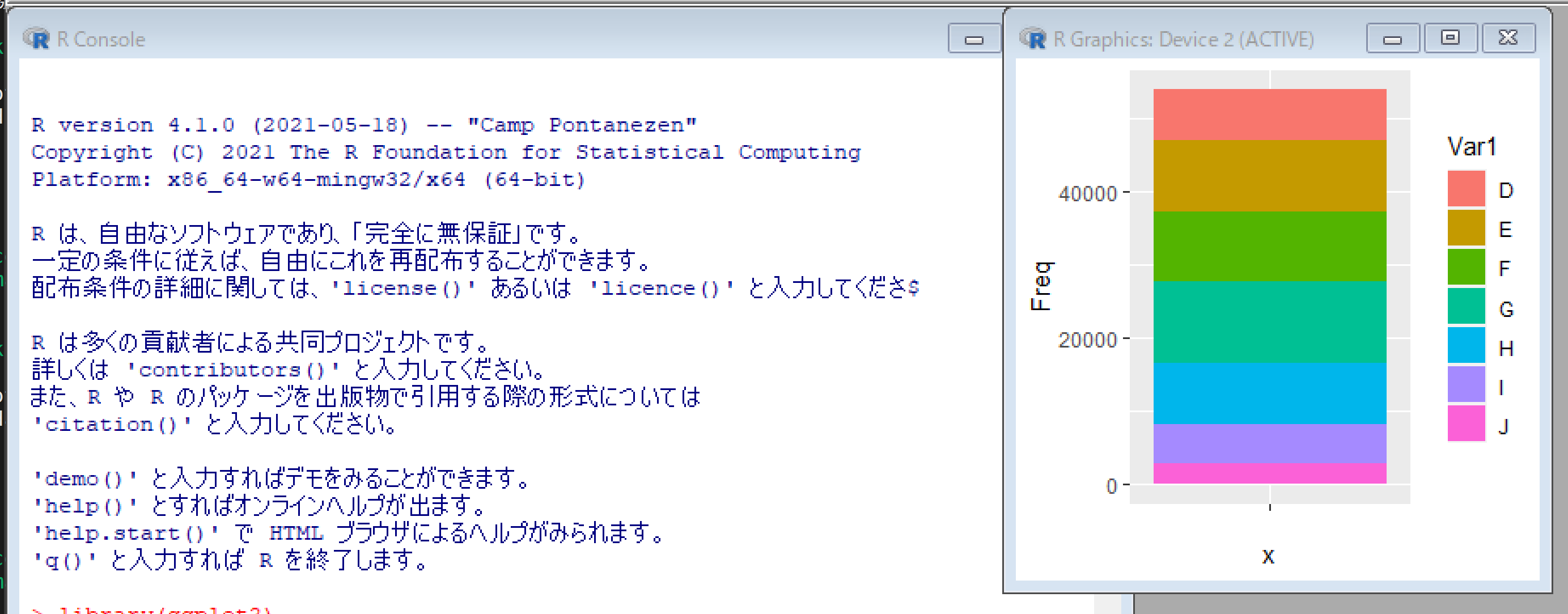
library(ggplot2)
p <- ggplot(data.frame(table(diamonds$color)), aes(x = "", y = Freq, fill = Var1))
p + geom_bar( width = 1, stat = "identity" )
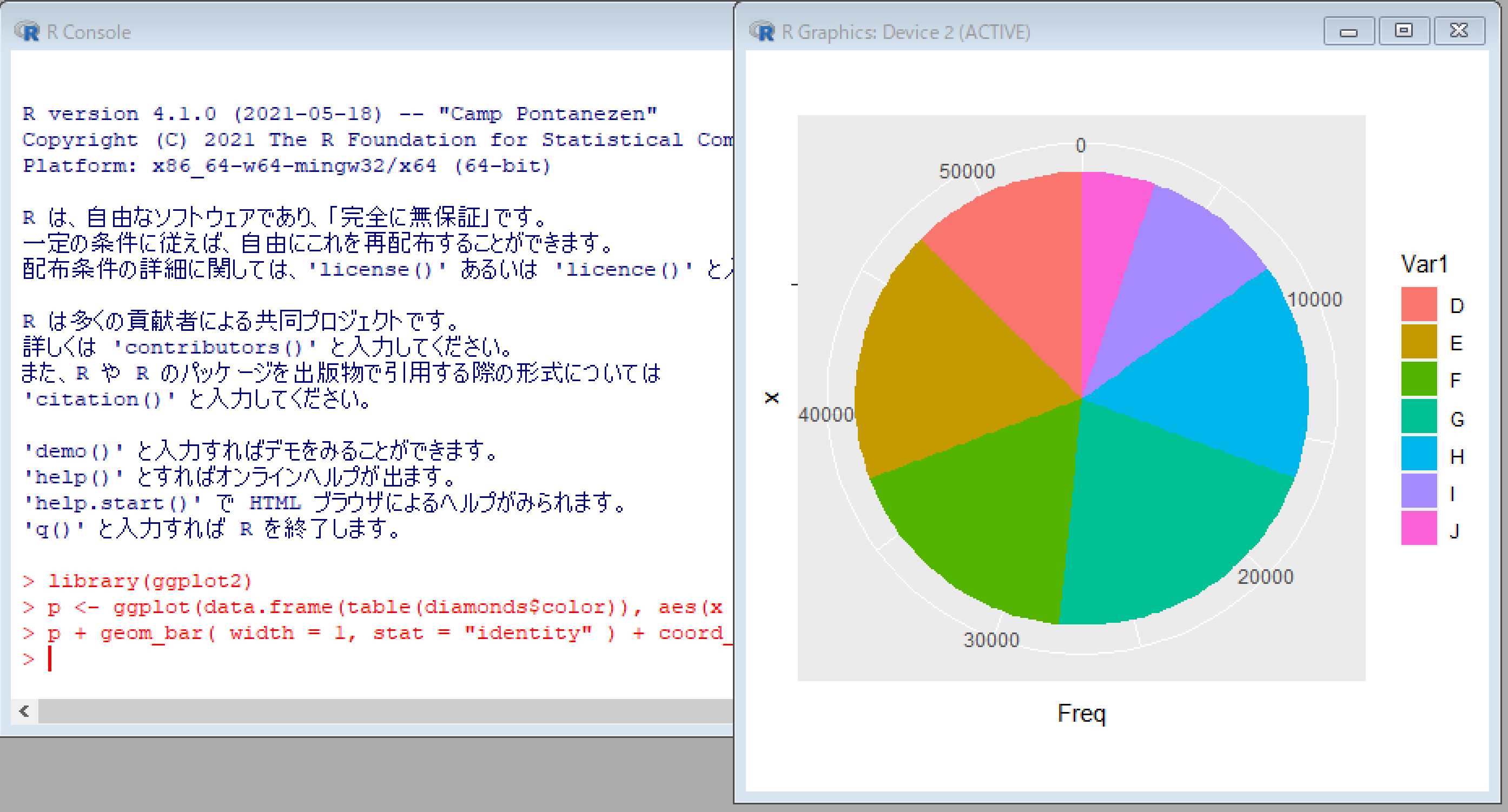
円グラフ
library(ggplot2)
p <- ggplot(data.frame(table(diamonds$color)), aes(x = "", y = Freq, fill = Var1))
p + geom_bar( width = 1, stat = "identity" ) + coord_polar("y")