R システムで3次元散布図の作成(R システム,rgl,scatterplot3d を使用)
あらかじめ決めておく事項
散布図を作成する CSV ファイル名と属性名を決めておく.
このページでは,次のように書く.
- 散布図を作成する CSV ファイル名: C:\R\Book1.csv または /tmp/Book1.csv
- 属性名:seq, date, USD, EUR, AUD
属性名は英語になっていること.CSV ファイルの第一行目に書いていること(そうなっているものとして,手順を書く).
前準備
R システムのインストール
R システムの CRAN の URL: https://cran.r-project.org/
rgl パッケージのインストール
R システムで,次のコマンドを実行し,インストールする.
このとき「Secure CRAN mirrors」のような,ミラーサイトの選択画面が出たときは「Japan」のものを選ぶ.
install.packages("rgl")
"rgl" が思い出せないときは, utils:::menuInstallPkgs() の後,rgl を選択
scatterplot3d パッケージのインストール
R システムで,次のコマンドを実行し,インストールする.
このとき「Secure CRAN mirrors」のような,ミラーサイトの選択画面が出たときは「Japan」のものを選ぶ.
install.packages("scatterplot3d")
"scatterplot3d" が思い出せないときは, utils:::menuInstallPkgs() の後,scatterplot3d を選択
CSVファイルを読み込み,データフレームに格納
- (前準備) 使用する CSV ファイルの作成
Book1.csv をダウンロード (参考: 「外国為替データ(時系列データ)の情報源の紹介」の Web ページ)
以下の説明では、
- Windows の場合: データファイル名: C:\R\Book1.csv
- Linuxの場合: データファイル名: /tmp/Book1.csv
として説明を続ける.
* 自前の CSV ファイルを使うときの注意: read.table() 関数を使うので, 属性名は英語になっていること.属性名は,CSV ファイルの第一行目に書いていること. - 使用する CSV ファイルの確認
属性名が CSV ファイルの1行目に書かれていることを確認する.
- R の起動
- 「read.table」を用いて,CSV ファイルを R のデータフレームに読み込み
次のコマンドを実行.
◆ Windows での動作手順例
X <- read.table("C:/R/Book1.csv", header=TRUE, sep=",", na.strings="NA", dec=".", strip.white=TRUE);◆ Linux での動作手順例
X <- read.table("/tmp/Book1.csv", header=TRUE, sep=",", na.strings="NA", dec=".", strip.white=TRUE);R の read.table のオプション- X <- ・・・ 変数 X に読み込むという意味
- C:/R/Book1.csv, "/tmp/Book1.csv" ・・・ 読み込む CSV ファイル名.Windows では区切りには「/」を使うことに注意.
- header="TRUE" または header="FALSE" ・・・ 列ラベルが設定されているか
- seq="," や seq="\" や seq=" " や ・・・ 列を区切る記号(CSV ファイルのときは「seq=","」)
- na.string="NA" ・・・ Not a Number には "NA" を使うという意味
- dec="." ・・・ ファイルで使われている小数点記号(既定値は,ピリオド)
- strip.white=TRUE ・・・ 個々のデータの先頭や末尾にある「空白文字」を取り除いて読み込む
- skip=<行数> ・・・ 読み飛ばし行数
- nrow=<行数> ・・・ 読み込み行数
- (その他のオプション) dec: ファイルで使われている小数点記号を指定できる
- オブジェクト X の確認
次のコマンドを実行.
edit(X);次のコマンドを実行.
str(X)
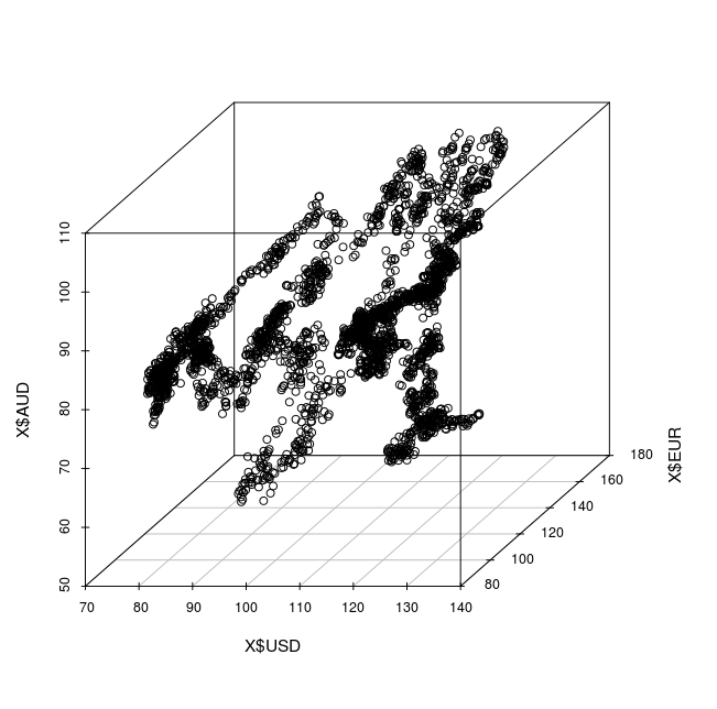
3次元散布図の実行例 (rgl を使用)
先ほど準備したデータを使用
- rgl パッケージの読み込み
次のコマンドを実行.
library(rgl) - plot3d の実行
plot3d(x = X$USD, y = X$EUR, z = X$AUD )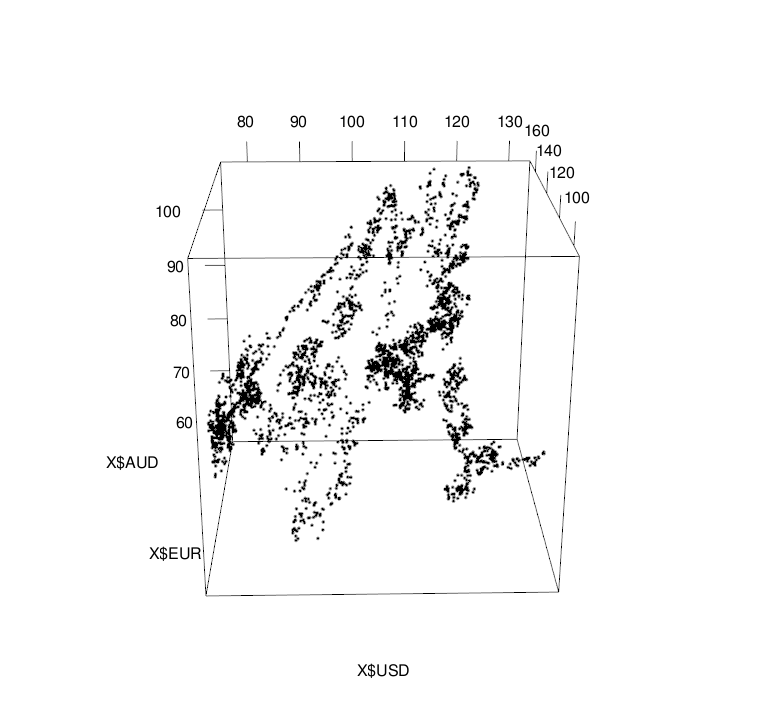
アニメーションの作成
◆ 実行手順例
plot3d(x = X$USD, y = X$EUR, z = X$AUD )
for( i in 0:359 ) {
  rgl.viewpoint( i, i/4 )
  rgl.snapshot( fmt="png", sprintf("hoge%03d.png", i)  )
}
* 1つの動画ファイルにまとめたい時は ffmpeg コマンドを使って 「ffmpeg -i /tmp/hoge%03d.png -vcodec mjpeg -sameq /tmp/hoge.avi 」
3次元散布図の作成 (scatterplot3d を使用)
先ほど読み込んだデータを使用
- scatterplot3d パッケージの読み込み
次のコマンドを実行.
library(scatterplot3d)
- scatterplot3d の実行
scatterplot3d(x = X$USD, y = X$EUR, z = X$AUD )
散布図の点に色付け.rgb() 関数を使用し,RGB 3原色で色を指定するが, ここではアルファ値を指定して,半透明にする.
scatterplot3d(x = X$USD, y = X$EUR, z = X$AUD,
main = "color = rep( rgb( ..., pch = 20",
color = rep( rgb(  c( length( X$USD ):1 ) / length( X$USD ), 0.5, 0.5, 0.2 ) ), pch = 20 )
(参考)scatterplot3d のヘルプ
Usage
scatterplot3d(x, y=NULL, z=NULL, color=par("col"), pch=NULL,
    main=NULL, sub=NULL, xlim=NULL, ylim=NULL, zlim=NULL,
    xlab=NULL, ylab=NULL, zlab=NULL, scale.y=1, angle=40,
    axis=TRUE, tick.marks=TRUE, label.tick.marks=TRUE,
    x.ticklabs=NULL, y.ticklabs=NULL, z.ticklabs=NULL,
    y.margin.add=0, grid=TRUE, box=TRUE, lab=par("lab"),
    lab.z=mean(lab[1:2]), type="p", highlight.3d=FALSE,
    mar=c(5,3,4,3)+0.1, col.axis=par("col.axis"),
    col.grid="grey", col.lab=par("col.lab"),
    cex.symbols=par("cex"), cex.axis=0.8 * par("cex.axis"),
    cex.lab=par("cex.lab"), font.axis=par("font.axis"),
    font.lab=par("font.lab"), lty.axis=par("lty"),
    lty.grid=par("lty"), lty.hide=NULL, log="", ...)
Arguments
- x the coordinates of points in the plot.
- y the y coordinates of points in the plot, optional if x is an appropriate structure.
- z the z coordinates of points in the plot, optional if x is an appropriate structure.
- color colors of points in the plot, optional if x is an appropriate structure. Will be ignored if highlight.3d = TRUE.
- pch plotting "character", i.e. symbol to use.
- main an overall title for the plot.
- sub sub-title.
- xlim, ylim, zlim the x, y and z limits (min, max) of the plot. Note that setting enlarged limits may not work as exactly as expected (a known but unfixed bug).
- xlab, ylab, zlab titles for the x, y and z axis.
- scale.y scale of y axis related to x- and z axis.
- angle angle between x and y axis (Attention: result depends on scaling. For 180 < angle < 360 the returned functions xyz.convert and points3d will not work properly.).
- axis a logical value indicating whether axes should be drawn on the plot.
- tick.marks a logical value indicating whether tick marks should be drawn on the plot (only if axis = TRUE).
- label.tick.marks a logical value indicating whether tick marks should be labeled on the plot (only if axis = TRUE and tick.marks = TRUE).
- x.ticklabs, y.ticklabs, z.ticklabs vector of tick mark labels.
- y.margin.add add additional space between tick mark labels and axis label of the y axis
- grid a logical value indicating whether a grid should be drawn on the plot.
- box a logical value indicating whether a box should be drawn around the plot.
- lab a numerical vector of the form c(x, y, len). The values of x and y give the (approximate) number of tickmarks on the x and y axes.
- lab.z the same as lab, but for z axis.
- type character indicating the type of plot: "p" for points, "l" for lines, "h" for vertical lines to x-y-plane, etc.
- highlight.3d points will be drawn in different colors related to y coordinates (only if type = "p" or type = "h", else color will be used). On some devices not all colors can be displayed. In this case try the postscript device or use highlight.3d = FALSE.
- mar A numerical vector of the form c(bottom, left, top, right) which gives the lines of margin to be specified on the four sides of the plot.
- col.axis, col.grid, col.lab the color to be used for axis / grid / axis labels.
- cex.symbols, cex.axis, cex.lab the magnification to be used for point symbols, axis annotation, labels relative to the current.
- font.axis, font.lab the font to be used for axis annotation / labels.
- lty.axis, lty.grid the line type to be used for axis / grid.
- lty.hide line style used to plot ‘non-visible’ edges (defaults of the lty.axis style)
- log Not yet implemented! A character string which contains "x" (if the x axis is to be logarithmic), "y", "z", "xy", "xz", "yz", "xyz". ... more graphical parameters can be given as arguments, pch = 16 or pch = 20 may be nice.
Author(s) Uwe Ligges ligges@statistik.tu-dortmund.de; http://www.statistik.tu-dortmund.de/~ligges.
References Ligges, U., and Maechler, M. (2003): Scatterplot3d ? an R Package for Visualizing Multivariate Data. Journal of Statistical Software 8(11), 1?20. http://www.jstatsoft.org/
See Also persp, plot, par.
種々のグラフ
- 「pch = 20 」を指定
黒丸でプロット
scatterplot3d(x = X$USD, y = X$EUR, z = X$AUD,
main = "pch=20",
pch = 20)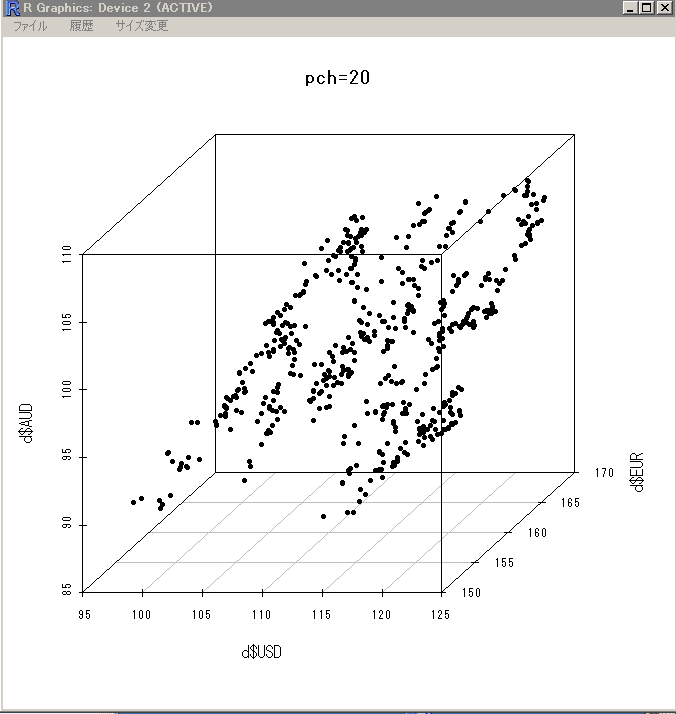
- 「color = ..., pch = 20」を指定
散布図の点に色付け
scatterplot3d(x = X$USD, y = X$EUR, z = X$AUD,
main = "color = ..., pch = 20",
color = rep( "green", length( X$USD ) ), pch = 20 )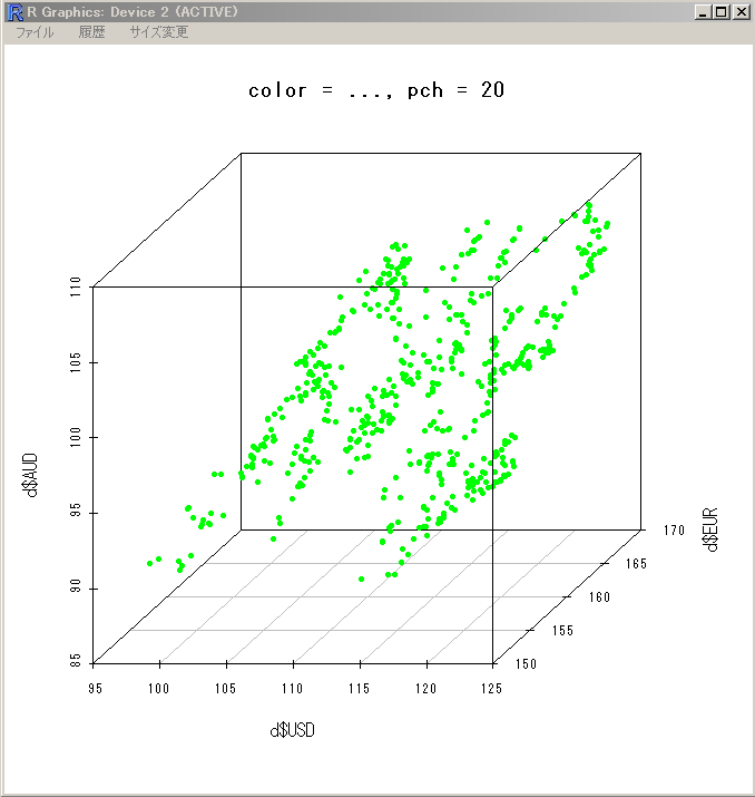
- 「color = rep( grey( ..., pch = 20」を指定
散布図の点に色付け.grey() 関数を使用し,濃淡付けを行う(ここでは,新しいほど,黒に近い色).
scatterplot3d(x = X$USD, y = X$EUR, z = X$AUD,
main = "color = rep( grey( ..., pch = 20",
color = rep( grey( c( length( X$USD ):1 ) / length( X$USD ) ) ), pch = 20 )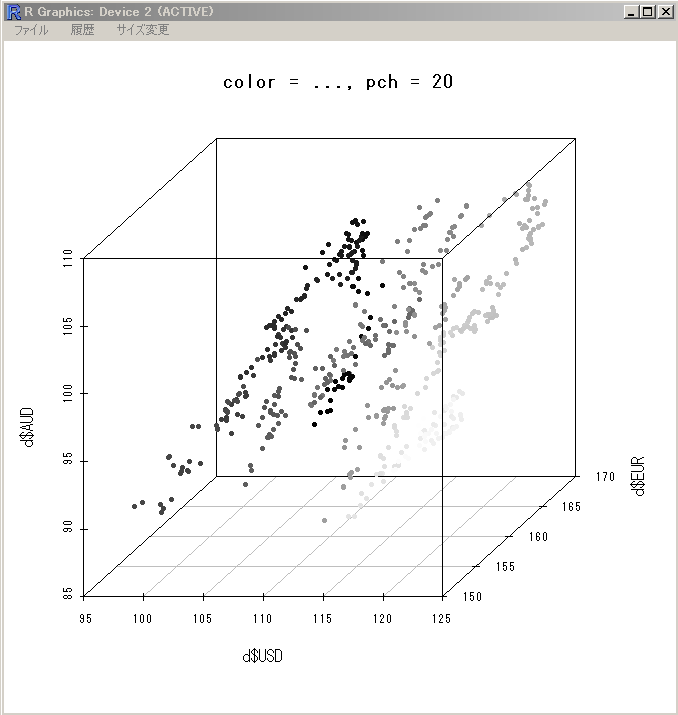
- 「color = rep( rgb( ..., pch = 20」を指定
散布図の点に色付け.rgb() 関数を使用し,RGB 3原色で色を指定する.
scatterplot3d(x = X$USD, y = X$EUR, z = X$AUD,
main = "color = rep( rgb( ..., pch = 20",
color = rep( rgb(  c( length( X$USD ):1 ) / length( X$USD ), 0.5, 0.5 ) ), pch = 20 )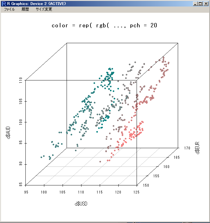
- 「color = rep( rgb( ..., pch = 20」を指定
散布図の点に色付け.rgb() 関数を使用し,RGB 3原色で色を指定するが, ここではアルファ値を指定して,半透明にする.
scatterplot3d(x = X$USD, y = X$EUR, z = X$AUD,
main = "color = rep( rgb( ..., pch = 20",
color = rep( rgb(  c( length( X$USD ):1 ) / length( X$USD ), 0.5, 0.5, 0.2 ) ), pch = 20 )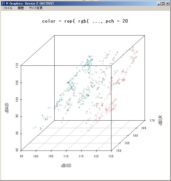
- 「highlight.3d=TRUE, pch = 20」を指定
遠近感を表現(z 軸報告の値を使って色を変える)
scatterplot3d(x = X$USD, y = X$EUR, z = X$AUD,
main = "highlight.3d=TRUE, pch = 20",
highlight.3d = TRUE, pch = 20)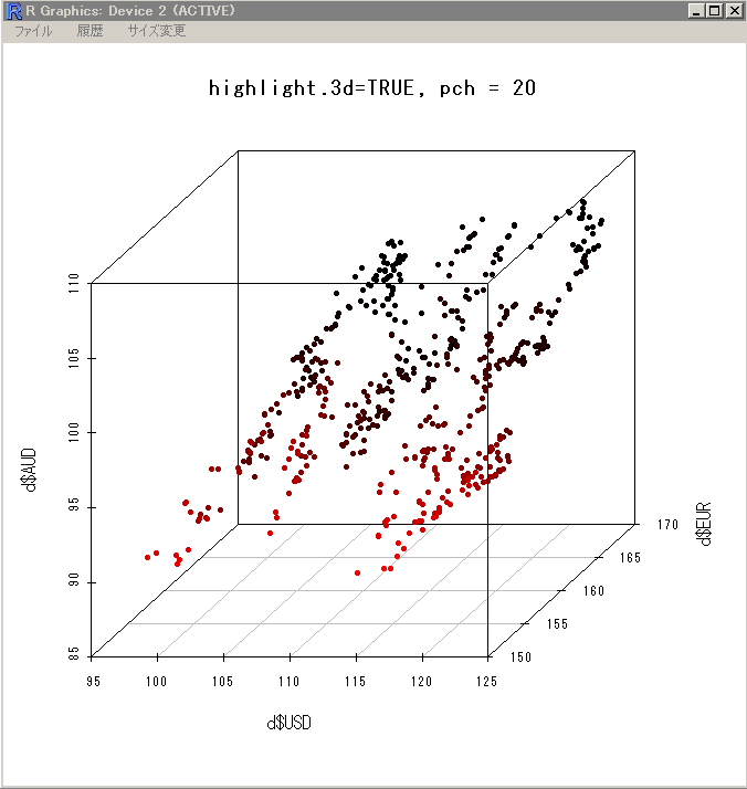
- 「highlight.3d=TRUE, type = "h", pch = 20」を指定
type = "h" を指定することで,縦棒が付加される.
scatterplot3d(x = X$USD, y = X$EUR, z = X$AUD,
main = "highlight.3d=TRUE, type = \"h\", pch = 20",
highlight.3d = TRUE, type = "h", pch = 20)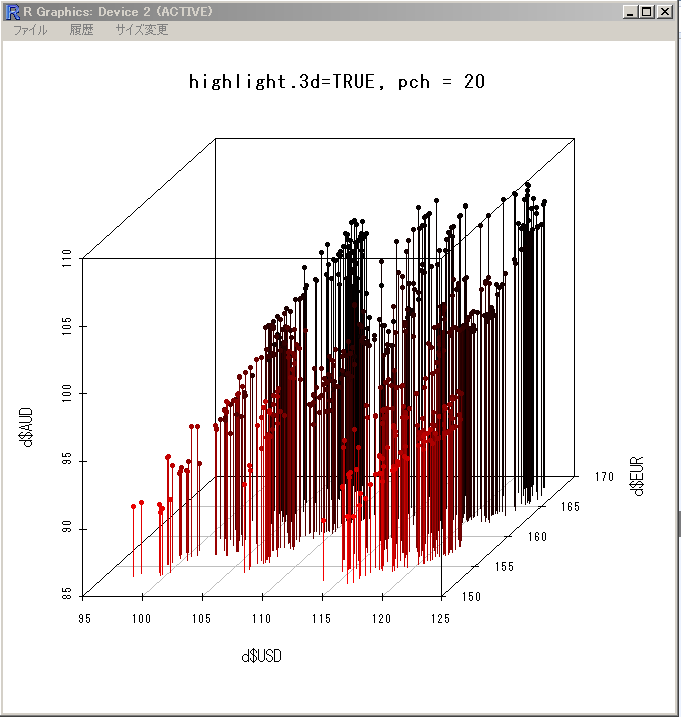
- 「highlight.3d=TRUE, type = "h", pch = " "」を指定
「type = "h", pch = " "」を指定することで,縦棒のみの表示になる.
scatterplot3d(x = X$USD, y = X$EUR, z = X$AUD,
main = "highlight.3d=TRUE, type = \"h\", pch = \" \"",
highlight.3d = TRUE, type = "h", pch = " " )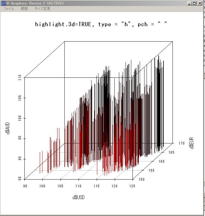
- 「highlight.3d=TRUE, type = "h", lwd = 5, pch = " "」を指定
「lwd = ...」を指定することで,縦棒の太さを調整できる.
scatterplot3d(x = X$USD, y = X$EUR, z = X$AUD,
main = "highlight.3d=TRUE, type = \"h\", lwd = 5, pch = \" \"",
highlight.3d = TRUE, type = "h", lwd = 5, pch = " " )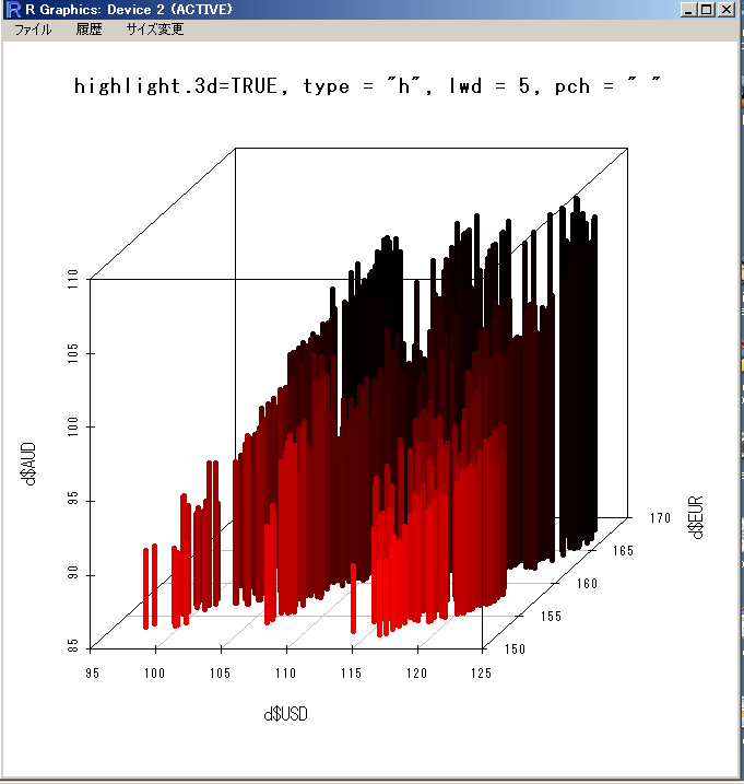
- 「col.axis="blue", col.grid="lightblue"」を指定
軸とグリッドの配色
scatterplot3d(x = X$USD, y = X$EUR, z = X$AUD,
main = "col.axis=\"blue\", col.grid=\"lightblue\"",
col.axis="blue", col.grid="lightblue",
highlight.3d = TRUE, pch = 20)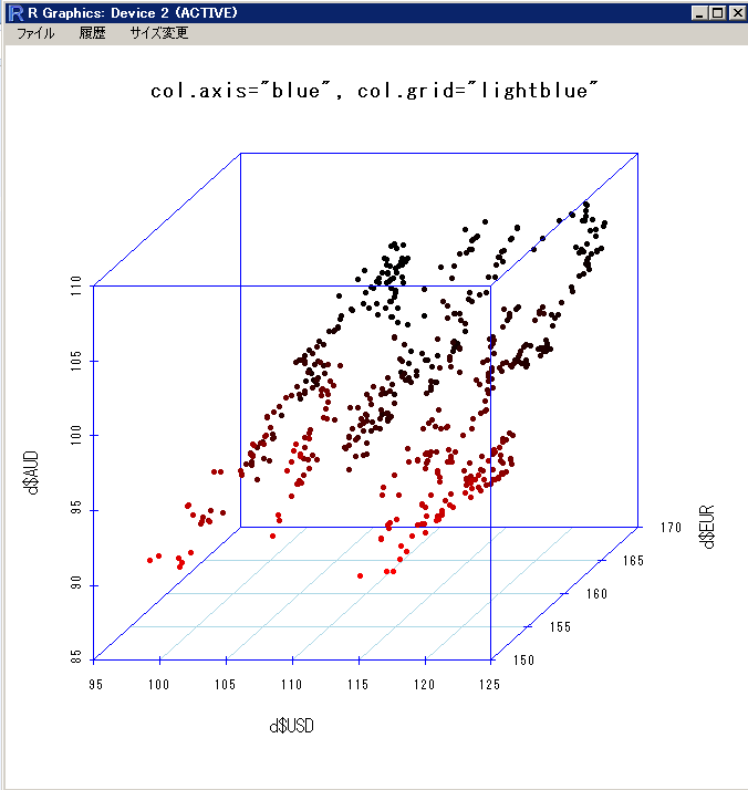
- 「x.ticklabs = c( "95 yen", "100 yen", "105 yen", "110 yen", "115 yen", "120 yen", "125 yen" )」を指定
目盛りに書かれる文字列の指定
scatterplot3d(x = X$USD, y = X$EUR, z = X$AUD,
main = "x.ticklabs= ...",
x.ticklabs = c( "95 yen", "100 yen", "105 yen", "110 yen", "115 yen", "120 yen", "125 yen" ),
col.axis="blue", col.grid="lightblue",
highlight.3d = TRUE, pch = 20)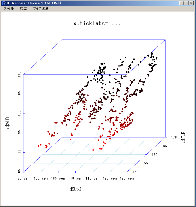
- 「angle = ...」を指定
角度の調整
scatterplot3d(x = X$USD, y = X$EUR, z = X$AUD,
main = "angle = 20",
col.axis="blue", col.grid="lightblue",
highlight.3d = TRUE, pch = 20,
angle = 20)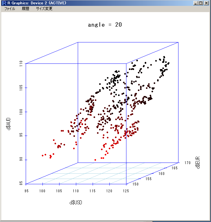
- 「angle = ..., scale.y = ...」を指定
角度の調整. scale.y では,表示される立体の y 方向の伸び縮み.
scatterplot3d(x = X$USD, y = X$EUR, z = X$AUD,
main = "angle = 20, scale.y = 0.5",
col.axis="blue", col.grid="lightblue",
highlight.3d = TRUE, pch = 20,
angle = 20, scale.y = 0.5)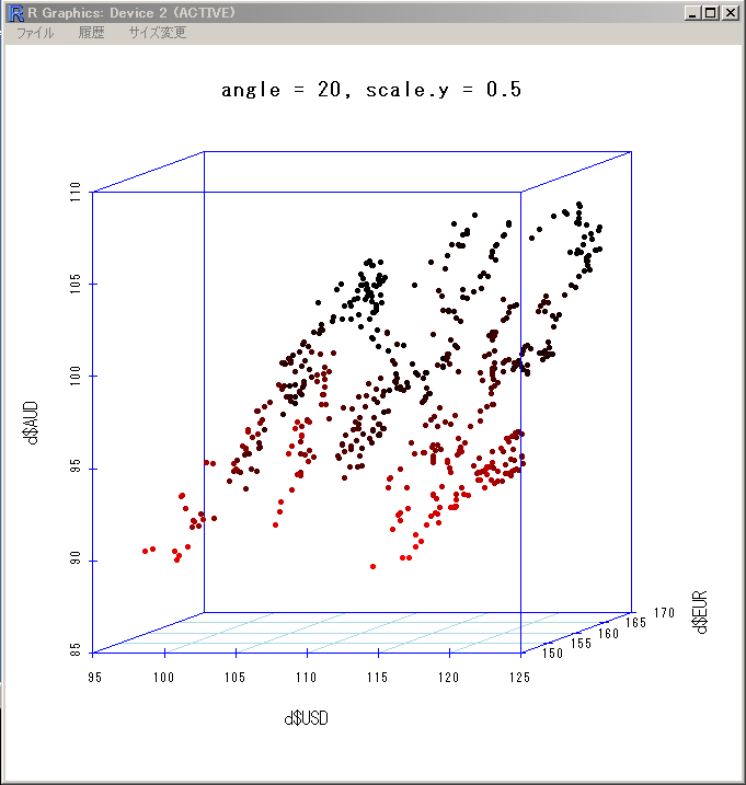
- 「zlim = c(90, 100)」を指定
描画範囲の指定
scatterplot3d(x = X$USD, y = X$EUR, z = X$AUD,
main = "zlim = c(90, 100)",
col.axis="blue", col.grid="lightblue", zlim = c(90, 100),
highlight.3d = TRUE, pch = 20)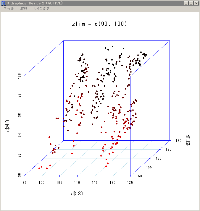
以下,scatterplot3d に付属のサンプルプログラムを引用.
  ## example 5
  data(trees)
  s3d <- scatterplot3d(trees, type="h", highlight.3d=TRUE,
      angle=55, scale.y=0.7, pch=16, main="scatterplot3d - 5")
  # Now adding some points to the "scatterplot3d"
  s3X$points3d(seq(10,20,2), seq(85,60,-5), seq(60,10,-10),
      col="blue", type="h", pch=16)
  # Now adding a regression plane to the "scatterplot3d"
  attach(trees)
  my.lm <- lm(Volume ~ Girth + Height)
  s3X$plane3d(my.lm, lty.box = "solid")

  ## example 6; by Martin Maechler
  cubedraw <- function(res3d, min = 0, max = 255, cex = 2, text. = FALSE)
  {
    ## Purpose: Draw nice cube with corners
    cube01 <- rbind(c(0,0,1), 0, c(1,0,0), c(1,1,0), 1, c(0,1,1), # < 6 outer
                    c(1,0,1), c(0,1,0)) # <- "inner": fore- & back-ground
    cub <- min + (max-min)* cube01
    ## visibile corners + lines:
    res3d$points3d(cub[c(1:6,1,7,3,7,5) ,], cex = cex, type = 'b', lty = 1)
    ## hidden corner + lines
    res3d$points3d(cub[c(2,8,4,8,6),     ], cex = cex, type = 'b', lty = 3)
    if(text.)## debug
        text(res3d$xyz.convert(cub), labels=1:nrow(cub), col='tomato', cex=2)
  }
  ## 6 a) The named colors in R, i.e. colors()
  cc <- colors()
  crgb <- t(col2rgb(cc))
  par(xpd = TRUE)
  rr <- scatterplot3d(crgb, color = cc, box = FALSE, angle = 24,
      xlim = c(-50, 300), ylim = c(-50, 300), zlim = c(-50, 300))
  cubedraw(rr)
  ## 6 b) The rainbow colors from rainbow(201)
  rbc <- rainbow(201)
  Rrb <- t(col2rgb(rbc))
  rR <- scatterplot3d(Rrb, color = rbc, box = FALSE, angle = 24,
      xlim = c(-50, 300), ylim = c(-50, 300), zlim = c(-50, 300))
  cubedraw(rR)
  rR$points3d(Rrb, col = rbc, pch = 16)